RED HEN PRESS
September 2024 - Present
I’ve been working with Red Hen Press, a small independent publishing company in Pasadena designing and illustrating original book covers for some of their upcoming book releases. These book covers were all conceptualized by me and were revised to varying degrees after receiving feedback from both the editorial team and the authors themselves.
They say don’t judge a book by its cover, but I hope you enjoy these book covers :)
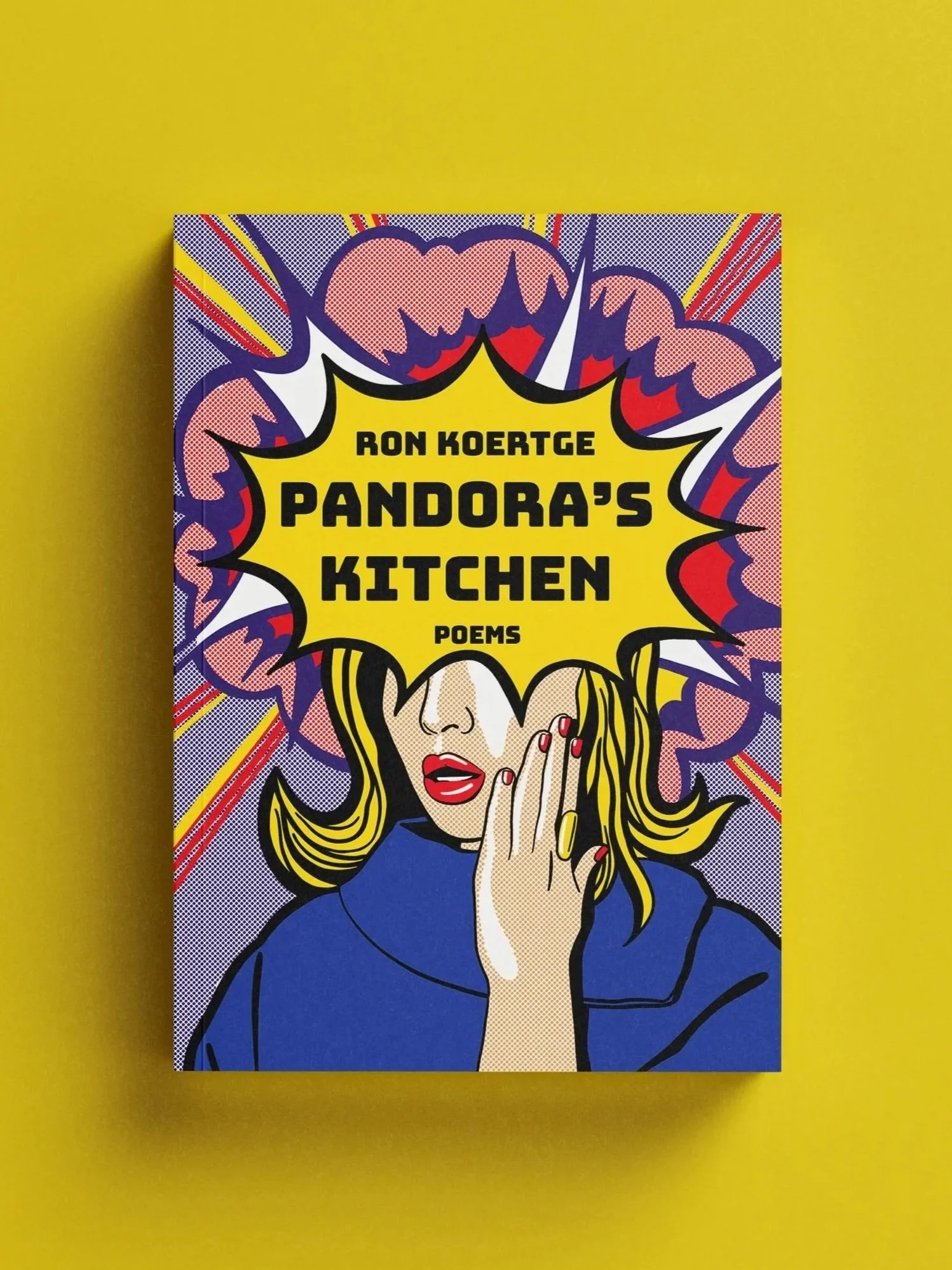
PANDORA’s KITCHen
Poems by Ron Koertge, Published by Red Hen Press (2025)
Pandora’s Kitchen is a modern book of poetry that uses humor and pop culture references to examine and dissect thought-provoking topics. The idea of poetry as an art form often brings with it ideas of intellectualism, classical literature, and the epic tales of Greek Mythology, so with this cover design I wanted to modernize that idea, mirroring the very thing the poems in the book do so well.
When I examined the tone of the writing and considered an artistic way to represent the way they consistently twisted the reader’s preconceived notions about poetry, I was instantly inspired by American Pop Art in the 1960s. The Pop Art movement was defined by a previously unheard of engagement and use of pop culture in fine art, an ideology that fit perfectly with this tongue in cheek style of poetry. Using imagery from the traditional Greek myth of Pandora and combining it with classic pop art techniques, I illustrated a variety of colorful book cover comps that were perfectly harmonious with the poems and the author’s vision for his work.
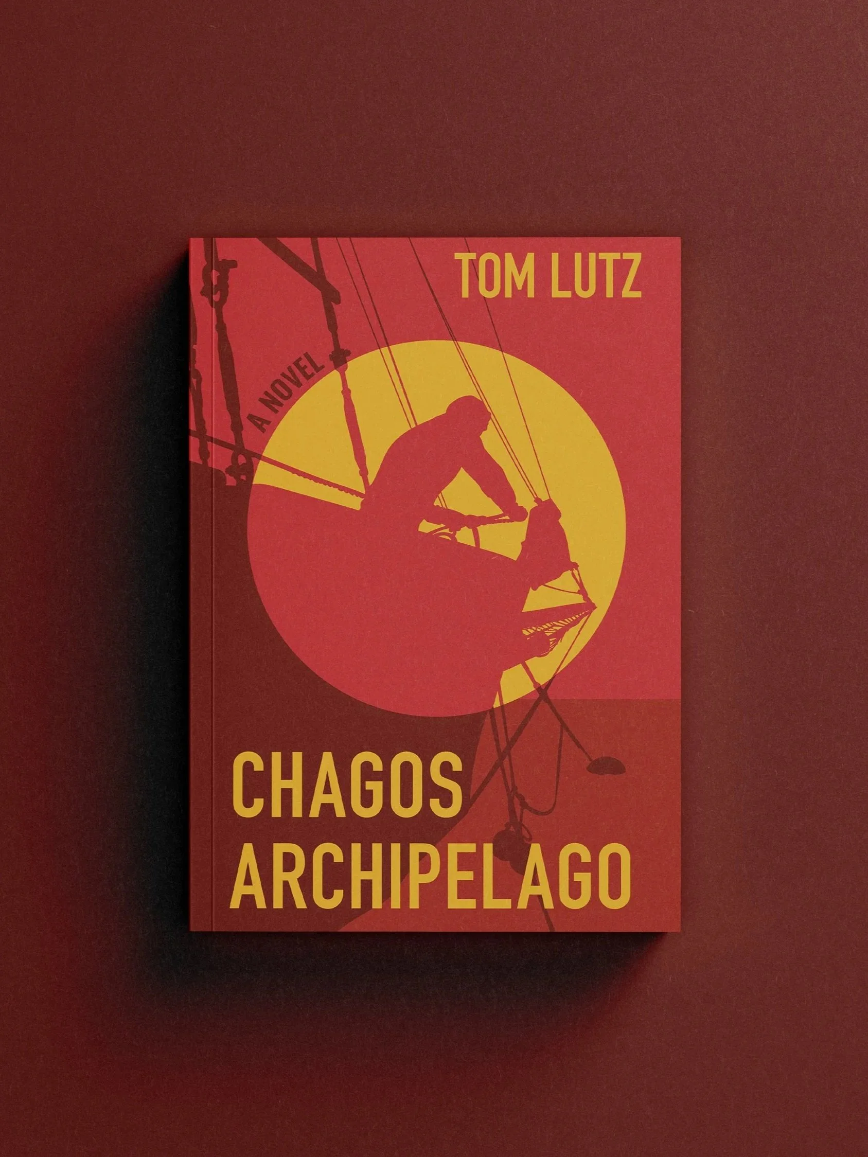
CHAGOS ARCHIPELAGO
A novel by Tom Lutz ● Published by Red Hen Press (2025)
Chagos Archipelago is a thriller novel follows multiple suspicious narrators as they begin to uncover the web of lies that tie them all together. As these seemingly unrelated people collide, the legitimacy of their identities as a assassins, oceanographers, and members of the military begin to come into question.
For the cover design, I wanted to incorporate the theme of naval intrigue through the use of boat imagery and employ a somewhat aggressive color story that would convey the danger inherent throughout the narrative.
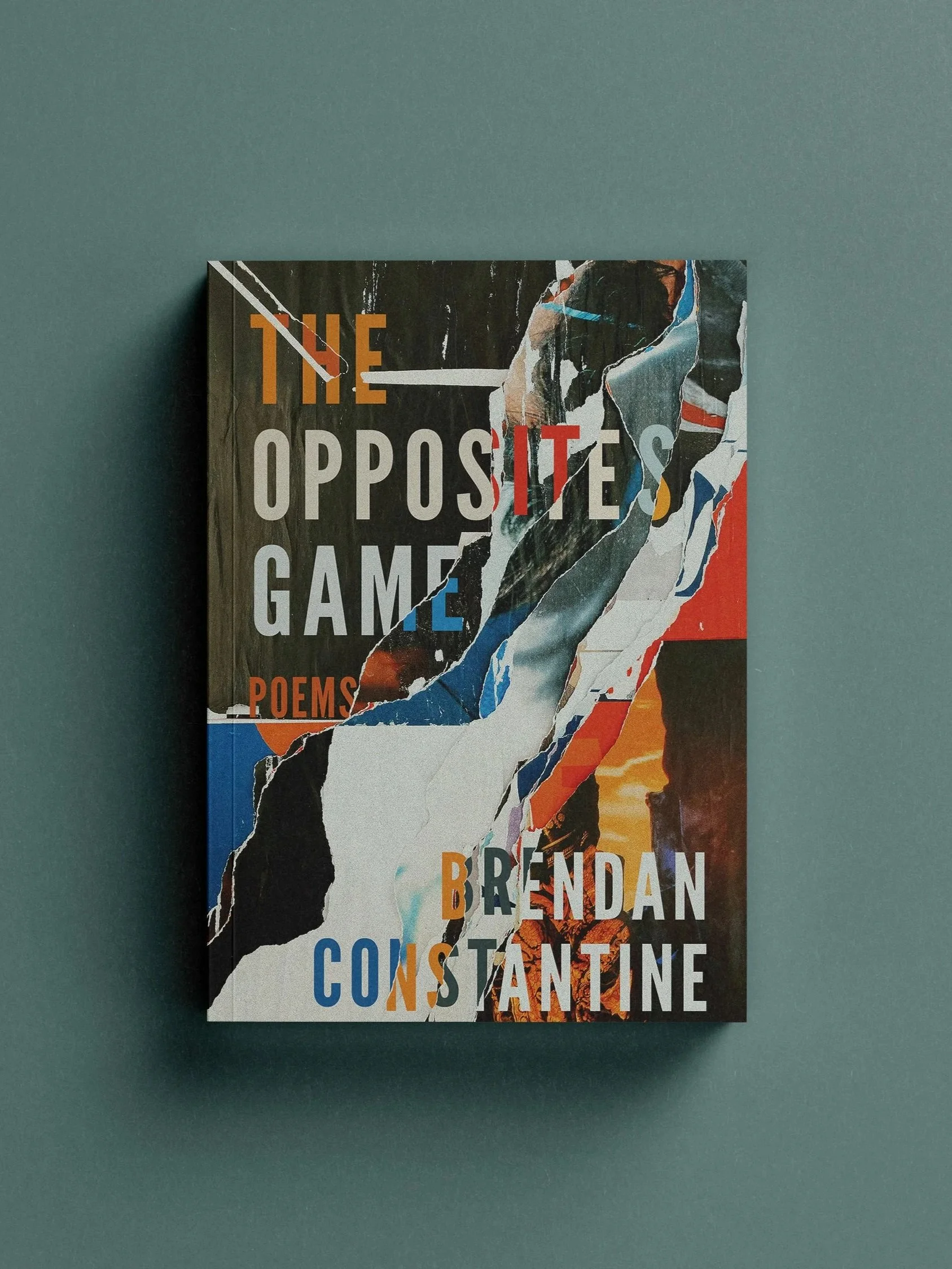
THE OPPOSITES GAME
Poems by Brendan Constantine ● Published by Red Hen Press (2026)
In The Opposites Game, readers are prompted to consider the abundance in their lives, consider the relationship between words and reality, and explore the rich, beautiful, and often perilous terrain of human thought and emotion.
Because none of the core facets of the book were attached to any specific imagery, I decided to go a bit more abstract with this design and create a modern and urban interpretation of human interaction and connection. This design is layers of old posters stuck up on a wall, peeling away from each other to reveal those below.
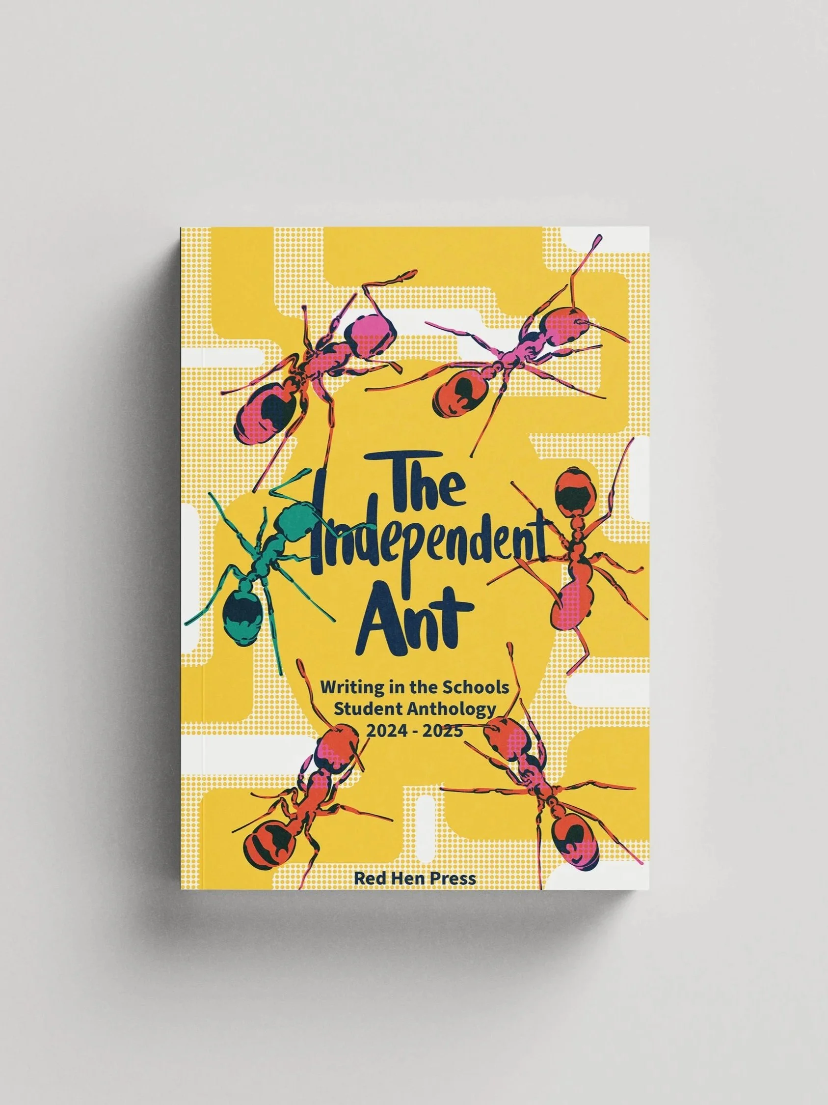
THE INDEPENDENT ANT
Writing in the Schools, Student Anthology, 2024-2025 Edition
Every year, Red Hen Press publishes a book of student writing from participating schools in LA County. The book is the final product of the Writing in the Schools Initiative, which is meant to encourage kids to hone their writing skills and have fun creating stories.
Because this edition was called The Independent Ant, I wanted to create a design that featured one stand out ant. I chose to give the cover a bit of a risograph look by implementing traditional riso colors, using the multiply effect, and implementing the dot pattern to replicate halftones.
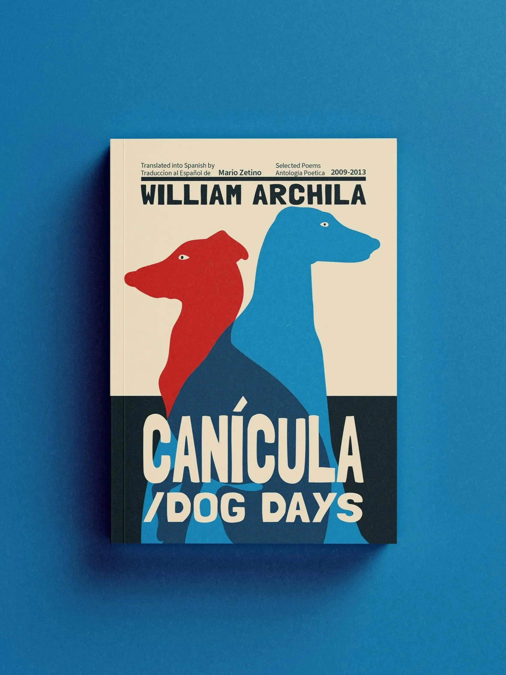
CANíCULA
Multilingual poems by William Archilla ● Published by Red Hen Press (2026)
Canícula, which means “dog days” in English, is a selection of poems from Archilla’s first two books of poetry, The Art of Exile and The Gravedigger’s Archaeology.
The poems are all written in both English and Spanish, and I felt that representing this through some sort of double image felt like a good representation of the philosophy at the core of this collection. Because the poems reflect on the past and how it impacted the future, I knew exact symmetry wouldn’t feel quite right for this design, so I opted to make the dogs visually distinct, with one looking back and reminiscing, while the other looks ahead into the unknown.
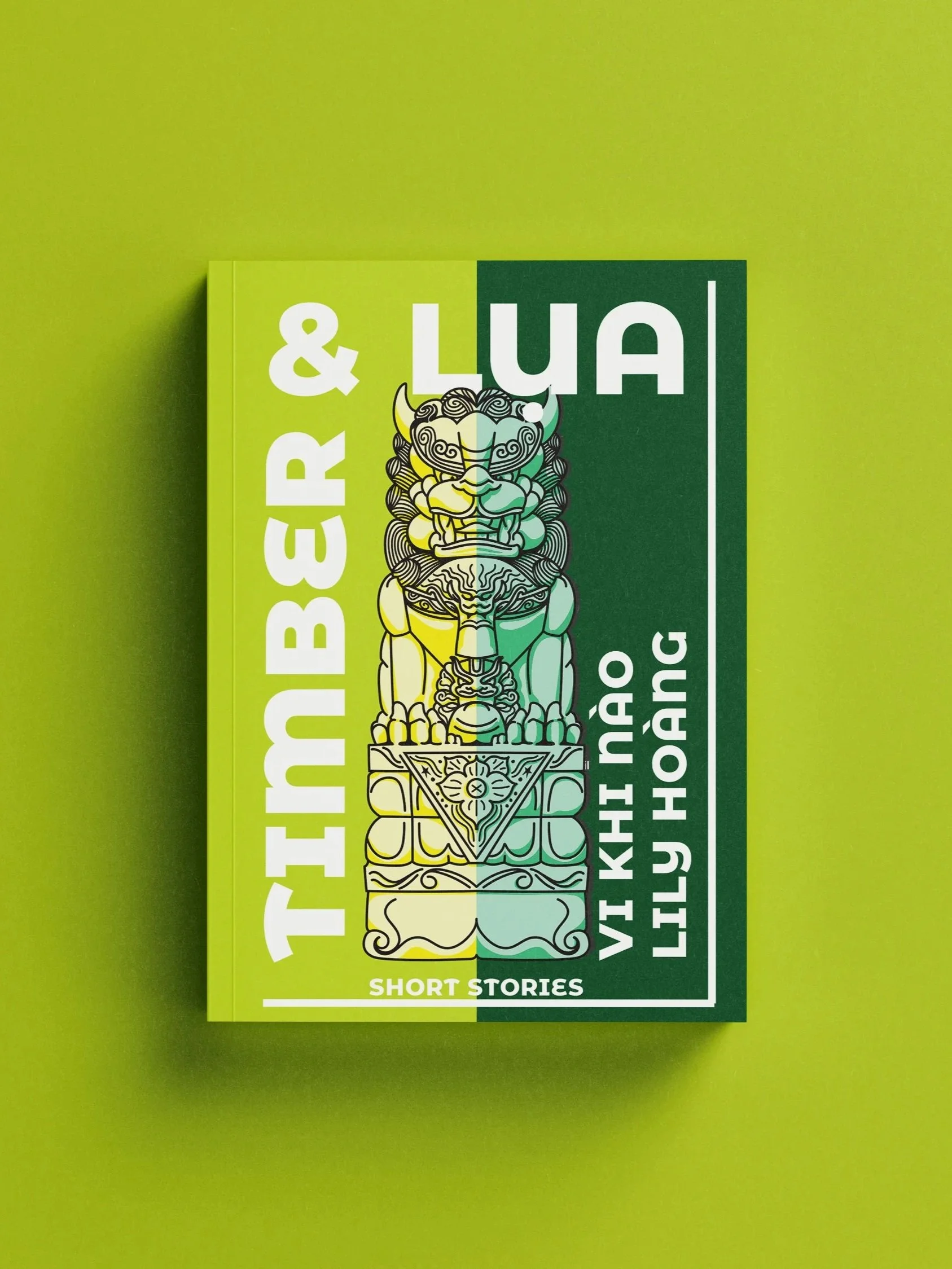
TIMBER & LuA
Short stories edited by Vi Khi Nào and Lily Hoàng ● Published by Red Hen Press (2026)
Timber & Lua is a collection of short stories written in a combination of English, Vietnamese, and “Viet-Lish” that explore combining the genetic material of these languages together to create a new literary paradigm.
Because of this experimental approach to language and storytelling, I wanted to create a cover design that felt fundamentally rooted in Vietnamese culture but didn’t necessarily use the traditional artistic approach. The traditional lion statues which I based this design on are typically placed near the entrance to a home to act as a guardian figure. In a way, a book cover represents the entrance to a book and the stories within, so I felt this imagery was appropriate and led readers into the experimental stories quite well.
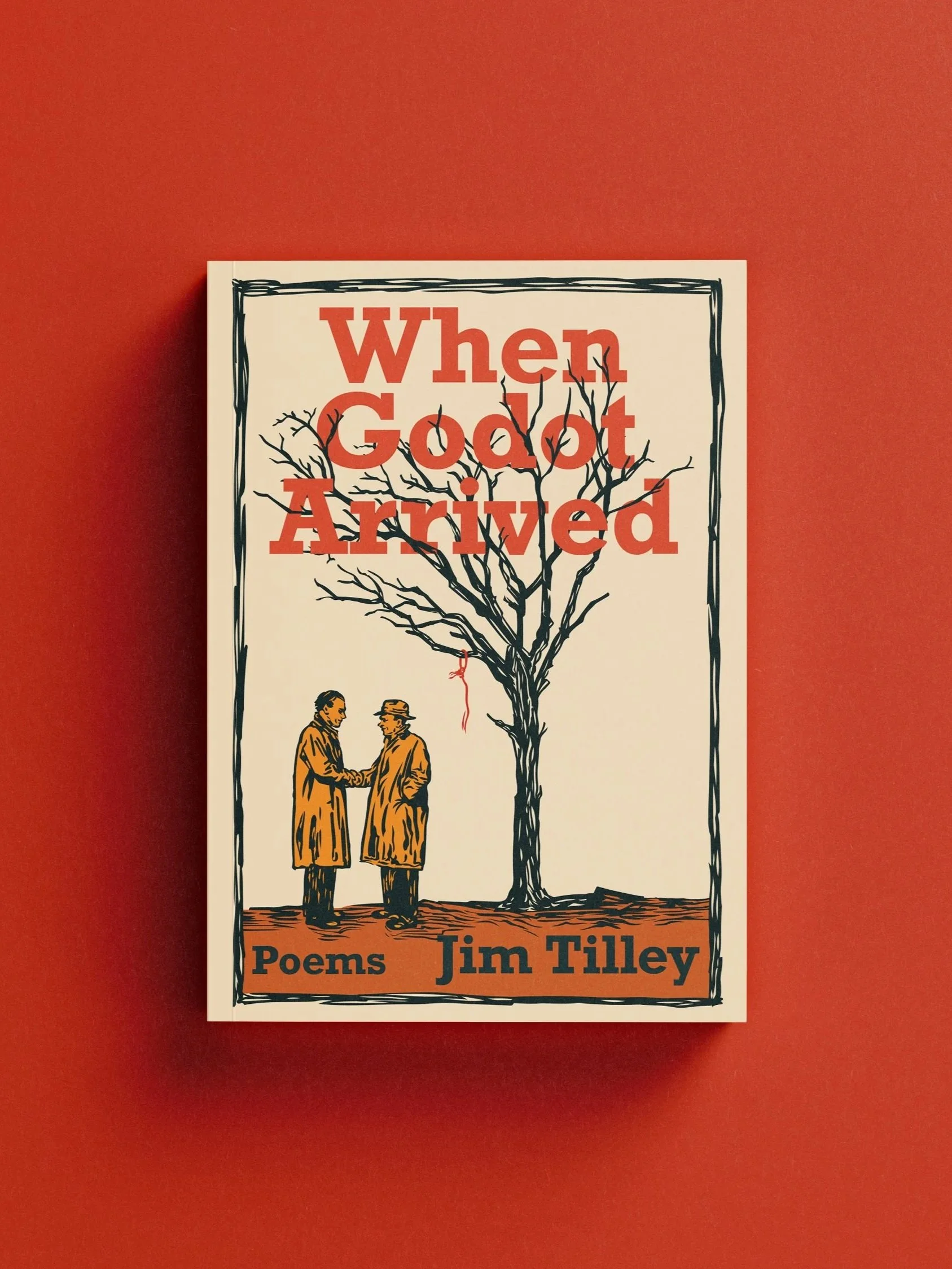
WHEN GODOT ARRIVED
Poems by Jim Tilley ● Published by Red Hen Press (2026)
Every year, Red Hen Press publishes a book of student writing from participating schools in LA County. The book is the final product of the Writing in the Schools Initiative, which is meant to encourage kids to hone their writing skills and have fun creating stories.
Because this edition was called The Independent Ant, I wanted to create a design that featured one stand out ant. I chose to give the cover a bit of a risograph look by implementing traditional riso colors, using the multiply effect, and implementing the dot pattern to replicate halftones.
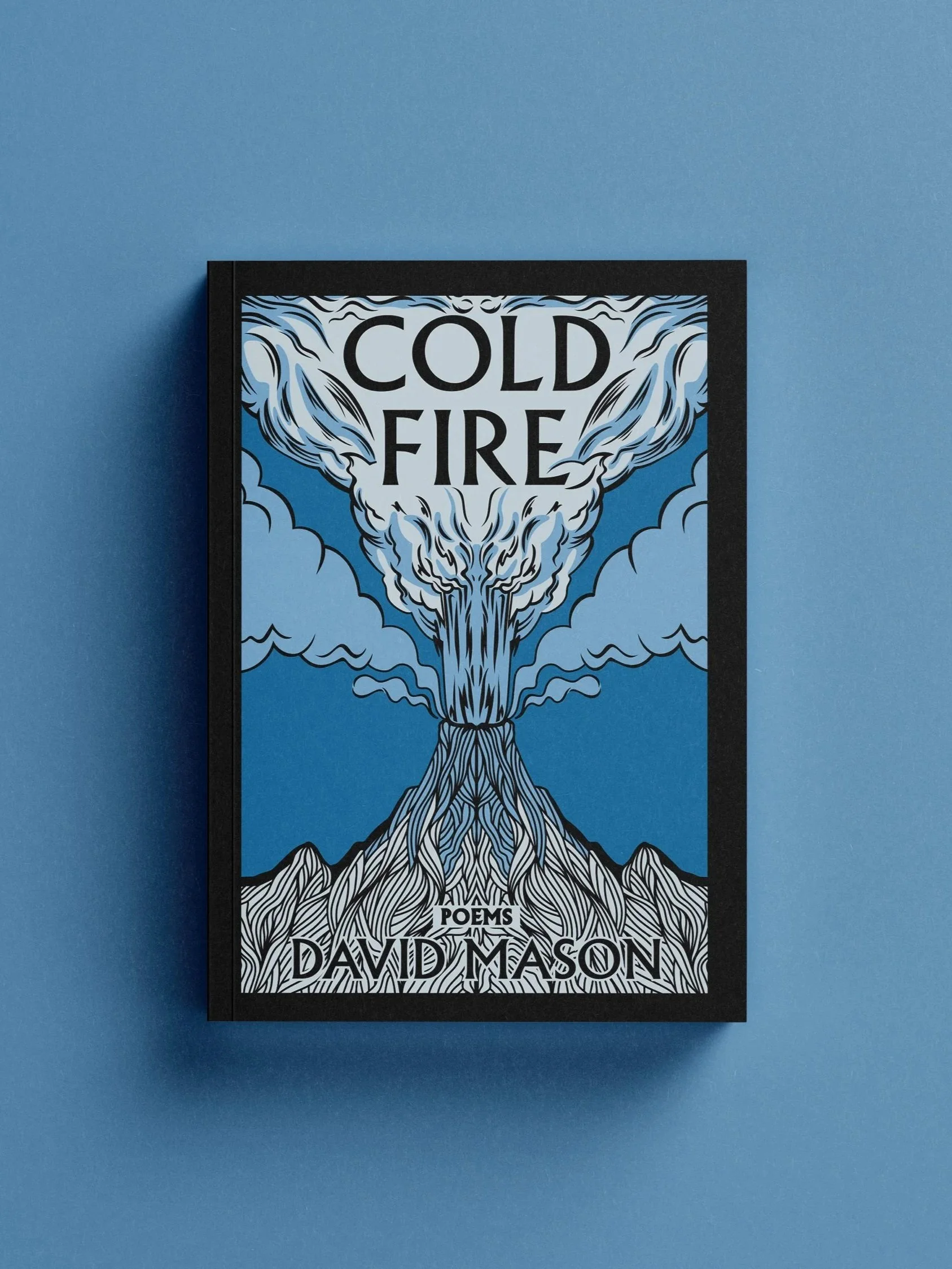
COLD FIRE
Poems by David Mason ● Published by Red Hen Press (2026)
This book of poetry encircles the globe with its scope, considering fire and ritual in different places all over the world. Life, art, and human conflict coexist in this rumination of nature in our world today.
Because fire and its symbolism plays such a key part in this collection of poetry, it made perfect sense to make a volcano become the main graphic for the cover. Nature is inherently random in its design, but to incorporate the ever present role humanity has in shaping the planet, I decided to make this design perfectly mirrored in an almost unnatural manner. The blue color palette ties into the name, and into the idea of subverting expectation of what fire is and could be.