BRAND DESIGN.
BRAND DESIGN.
For the past few years I’ve been working as a freelance logo + brand designer for small businesses looking to reinvigorate their brand or start something new with a strong visual identity. The diverse types of brands and projects gave me a lot of insight into the needs and wants of different types of businesses and what each one needs to succeed.
Here’s a few of the branding projects I’ve done to date.
TIMELESS DAY CREATIVE
Logo + Brand Design for a Creative Agency
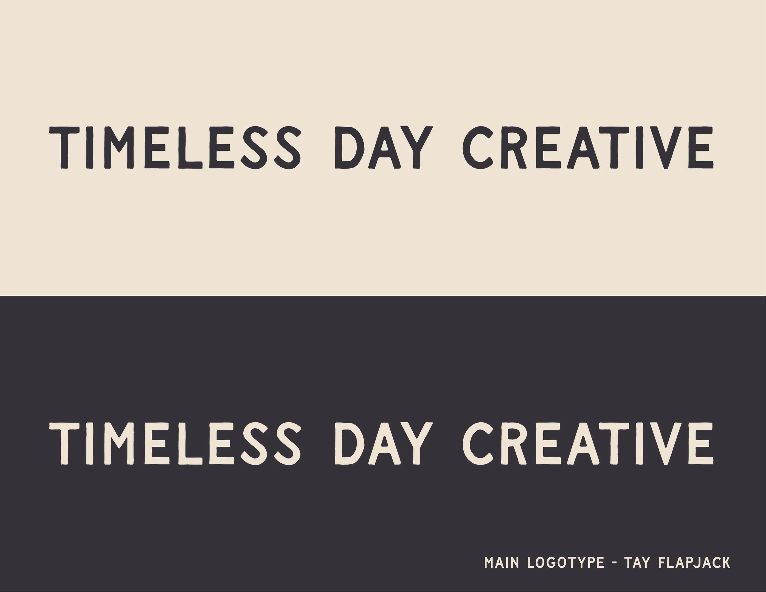
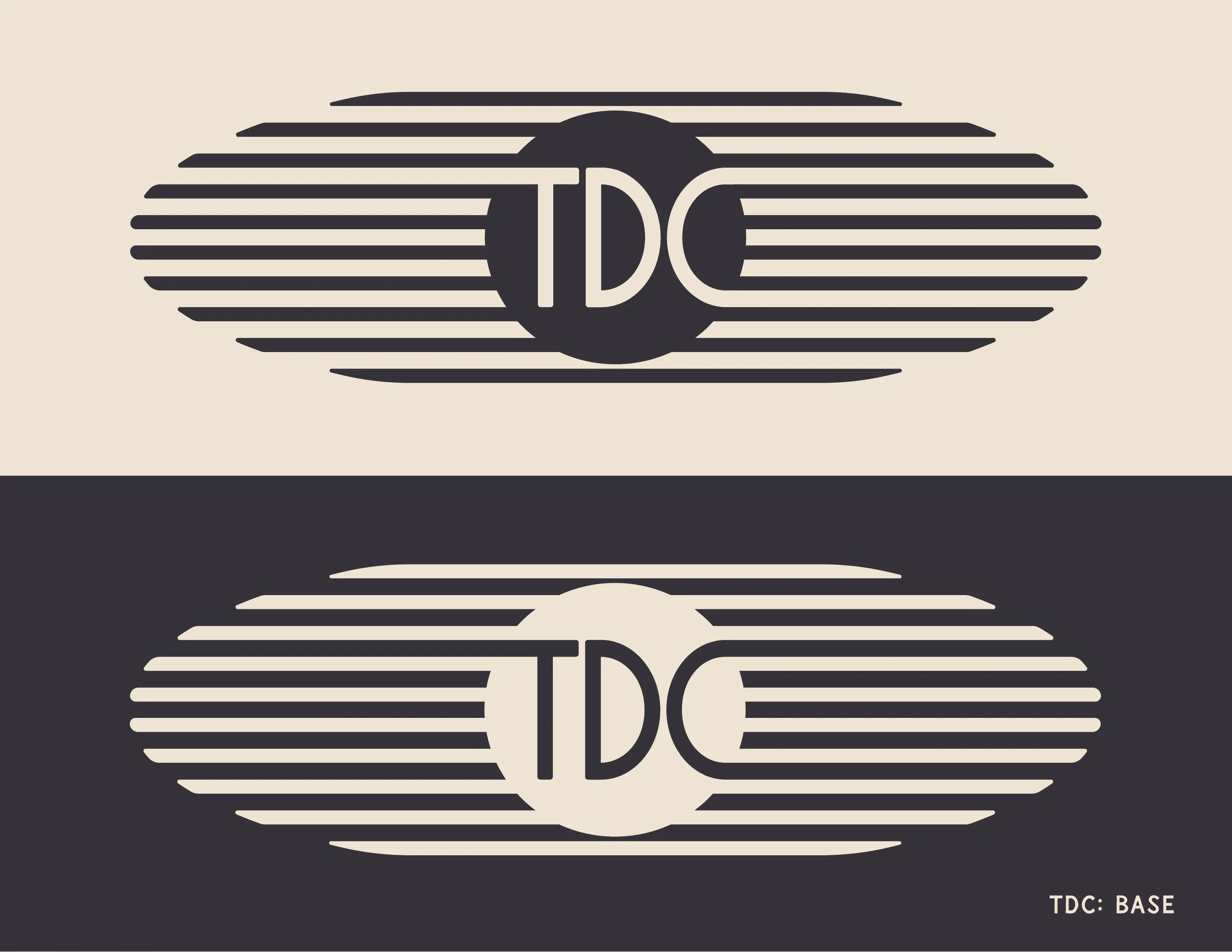
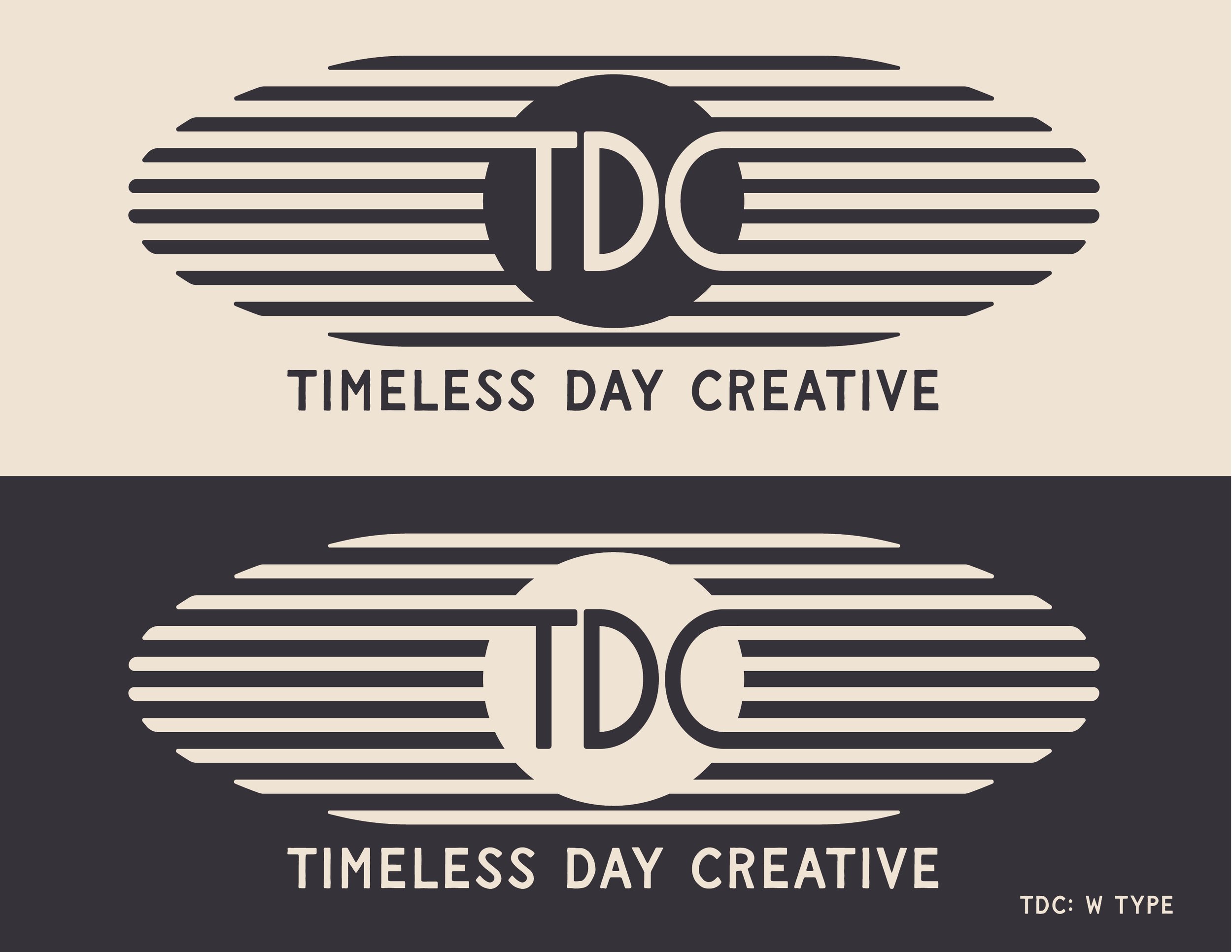
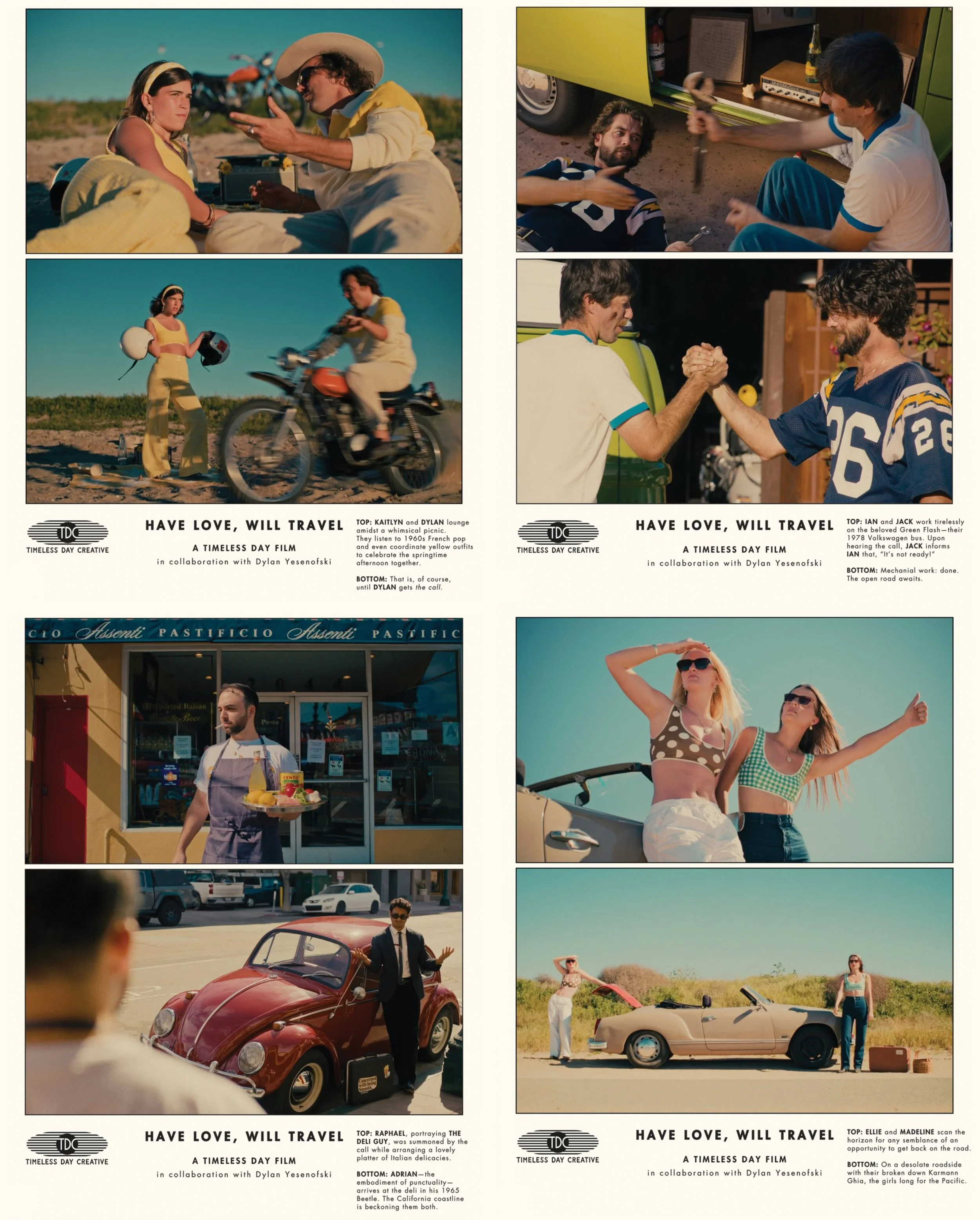
Timeless Day Creative is a creative agency rooted in the eclectic culture of San Diego. Founded by a group of lifelong friends, the agency revolves around youthful yet classic creative advertising that resonates authentically with people, no matter their generation.
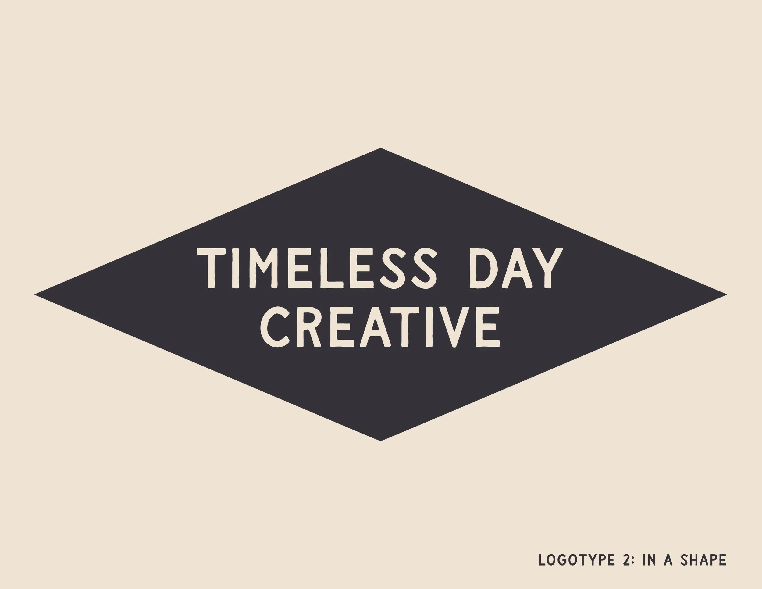
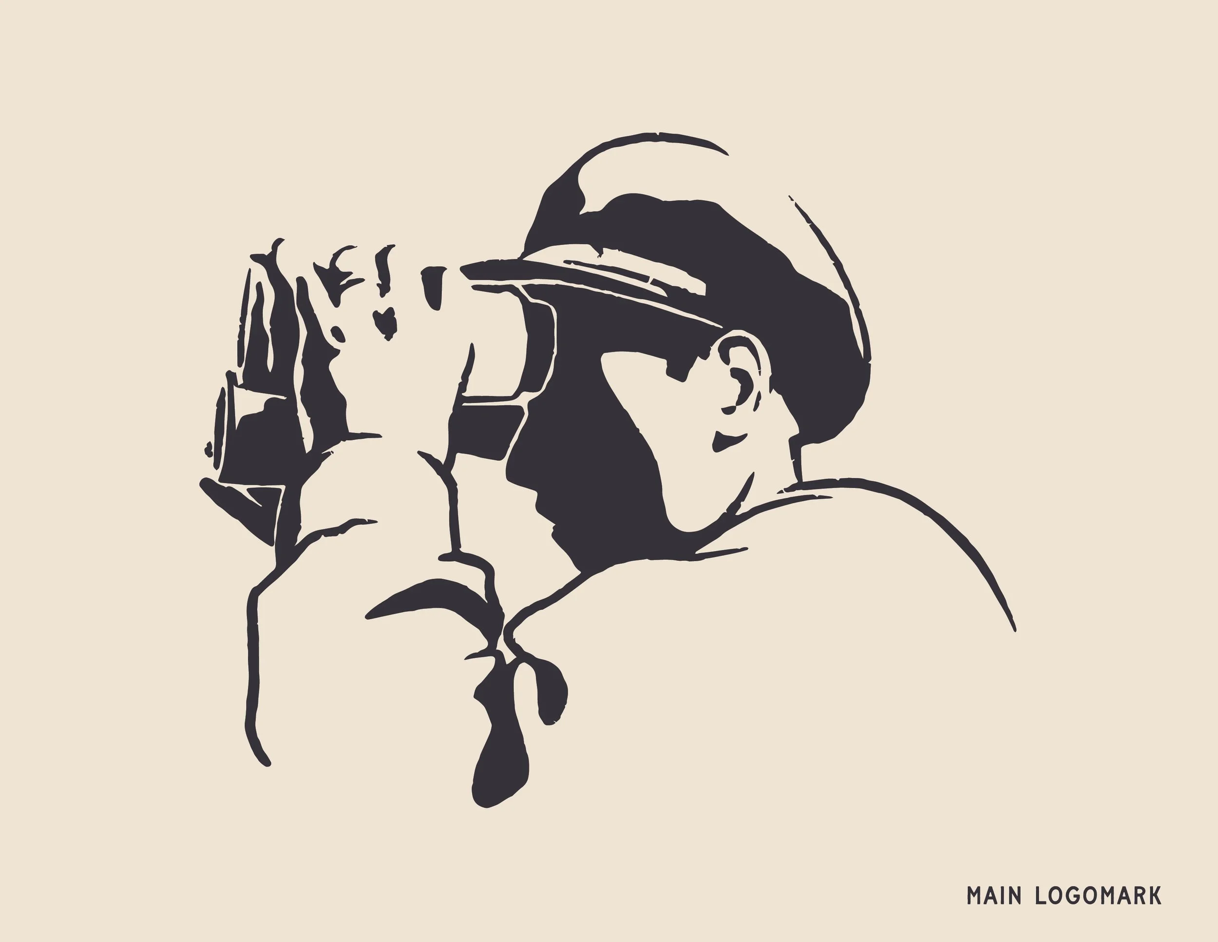
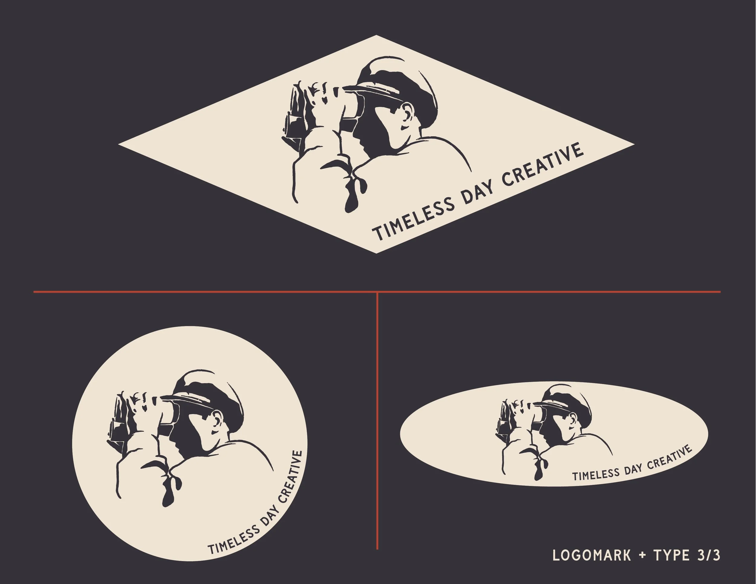
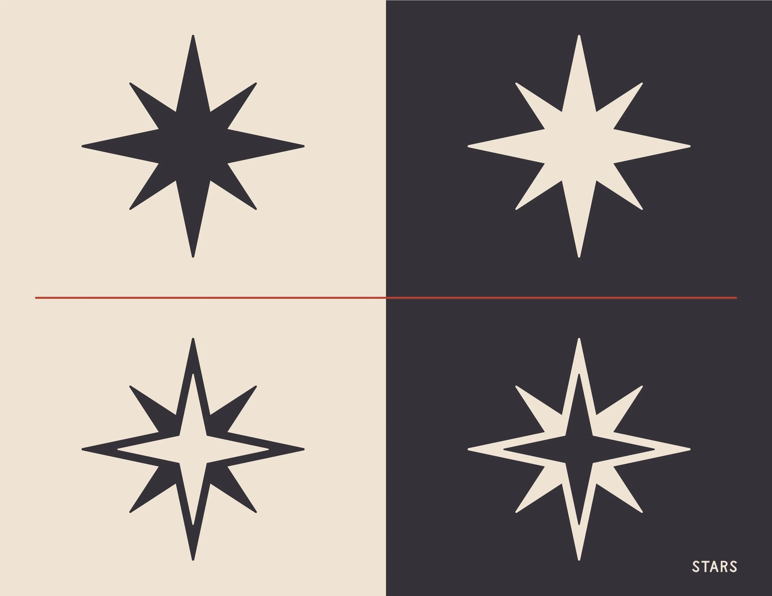
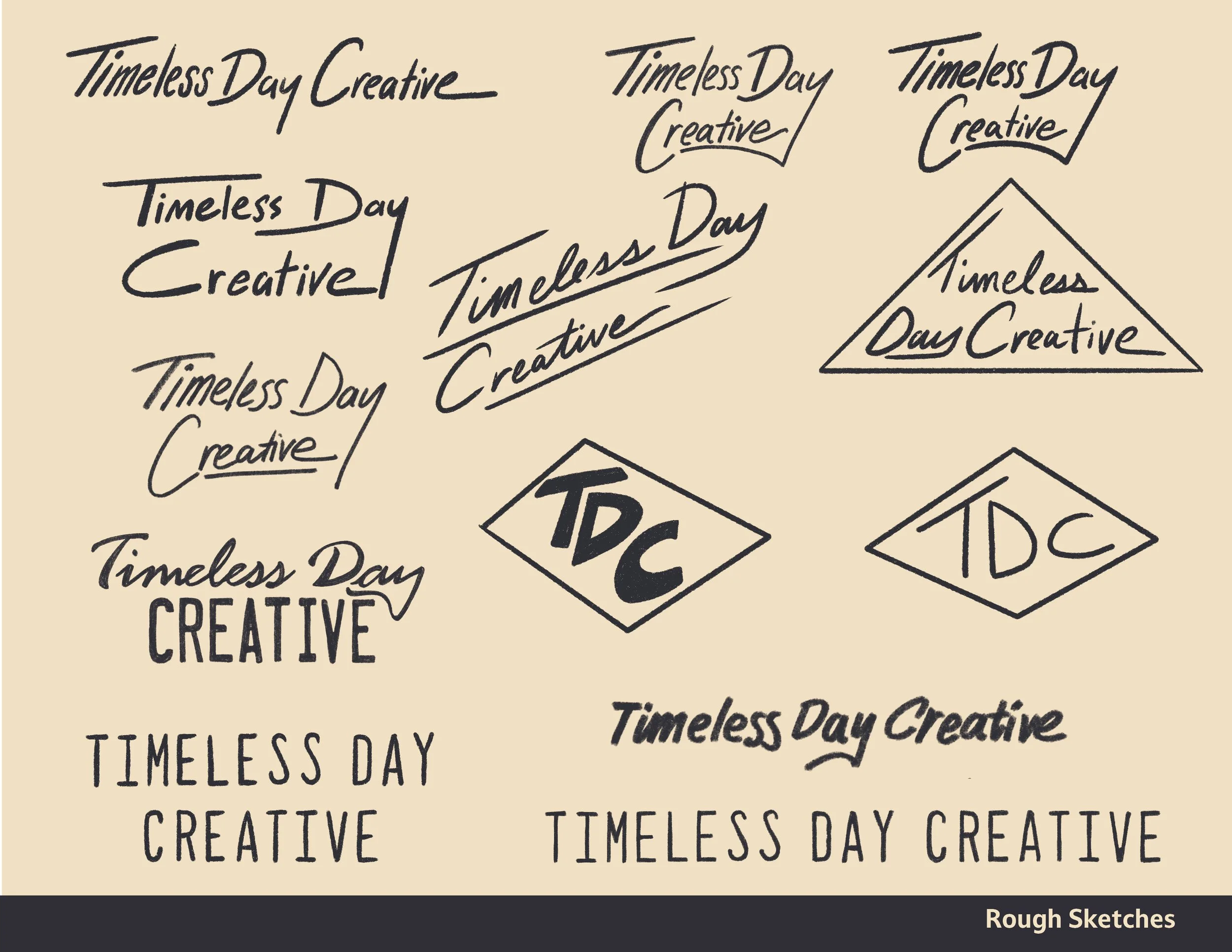
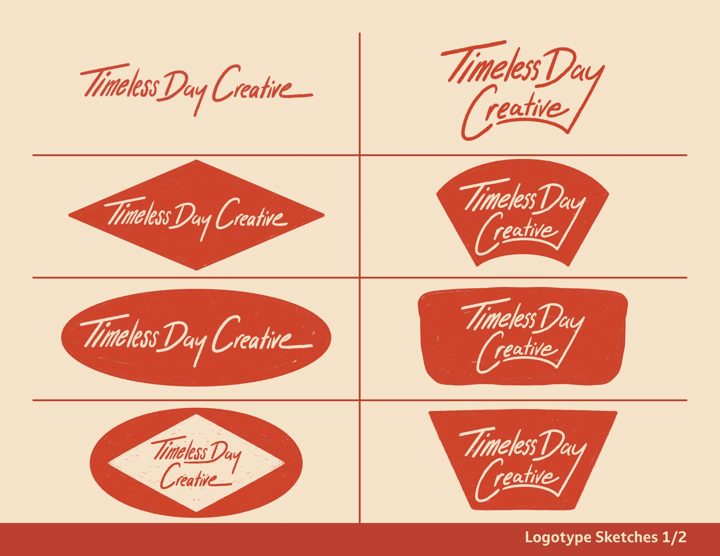
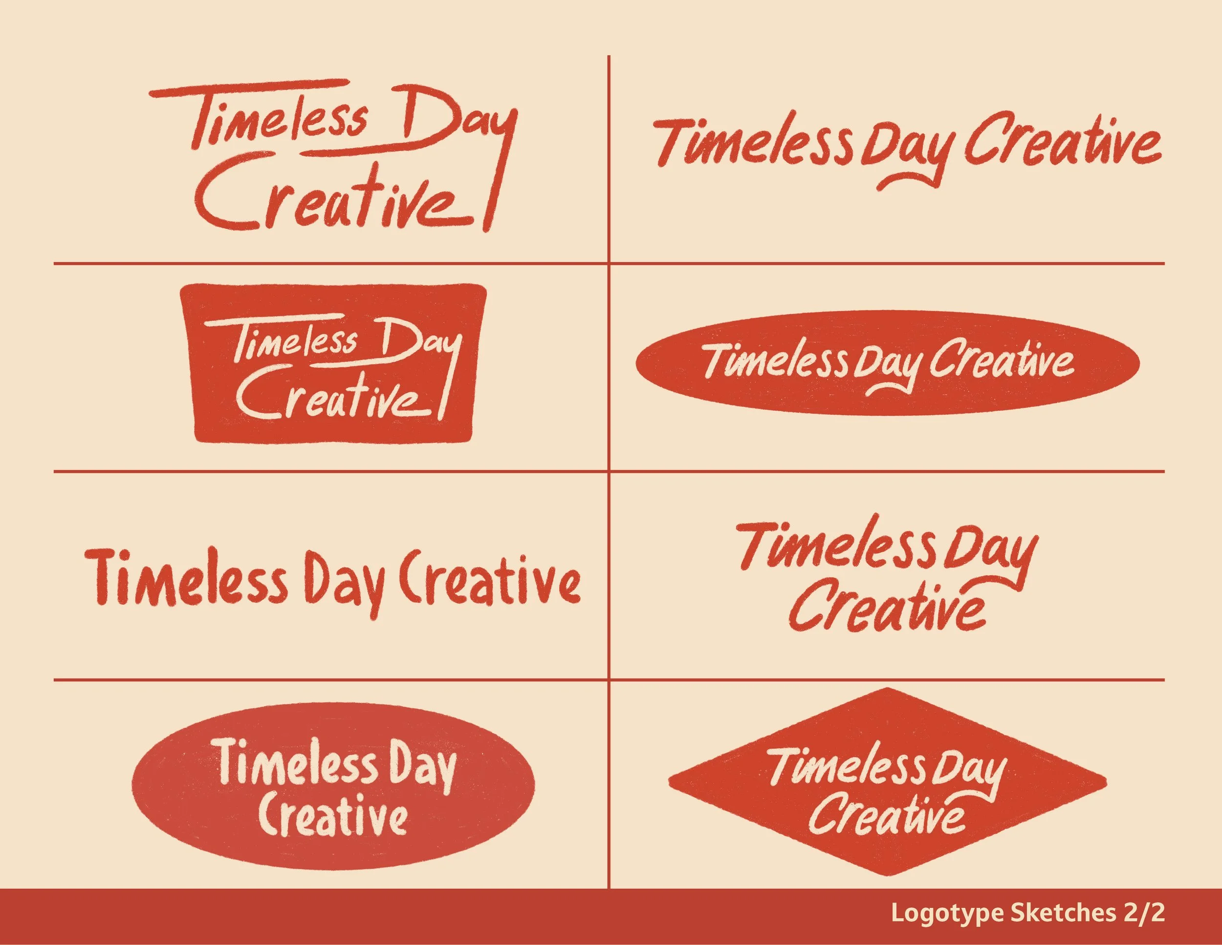
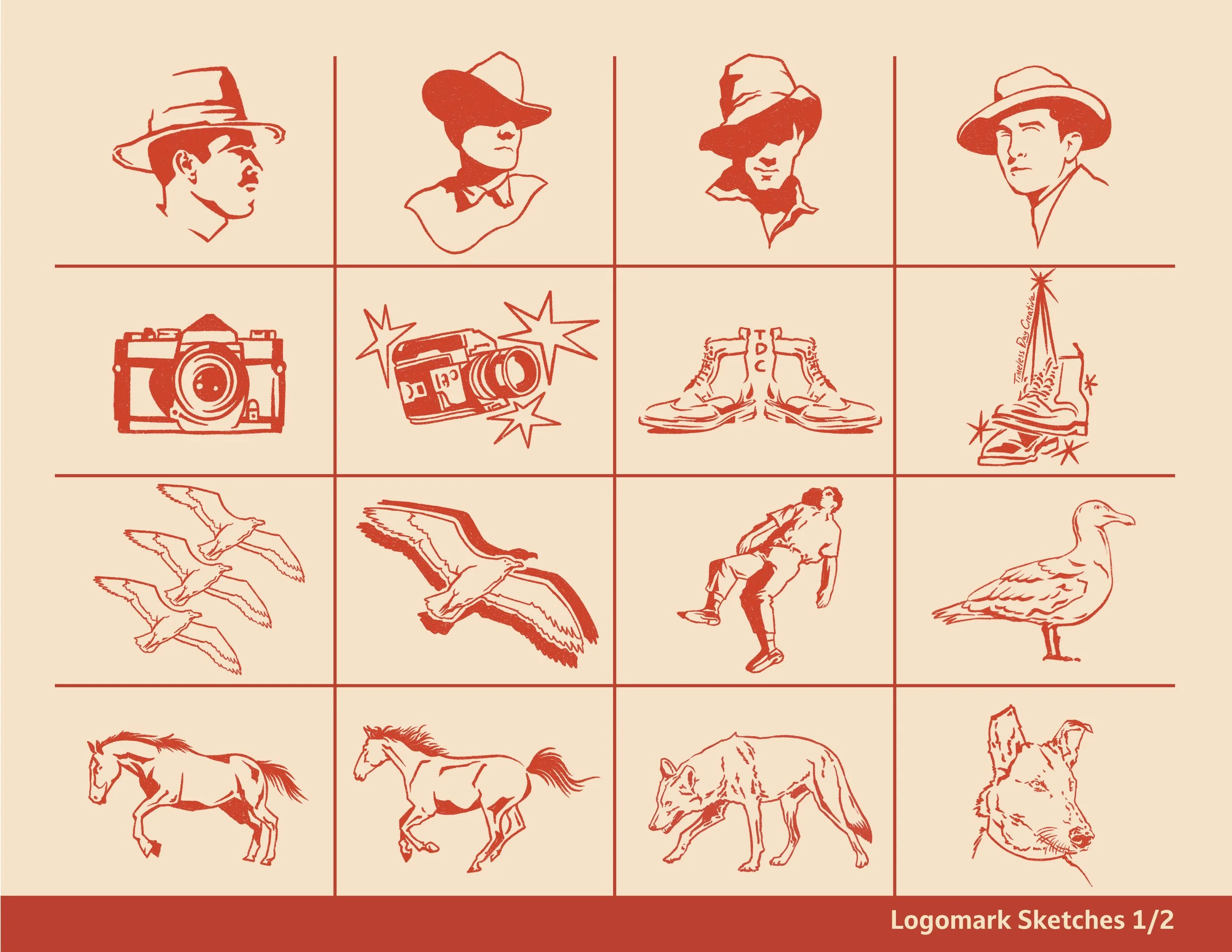
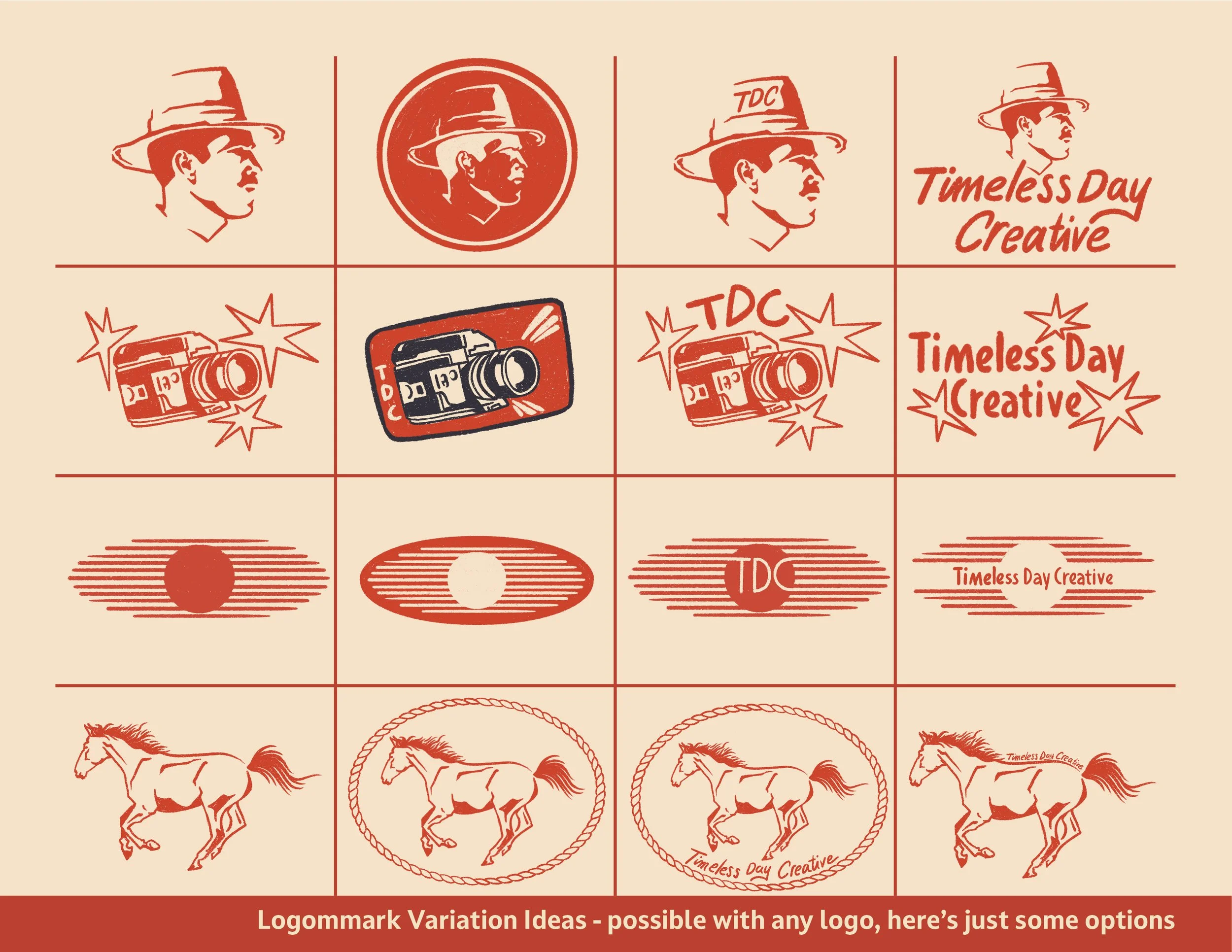
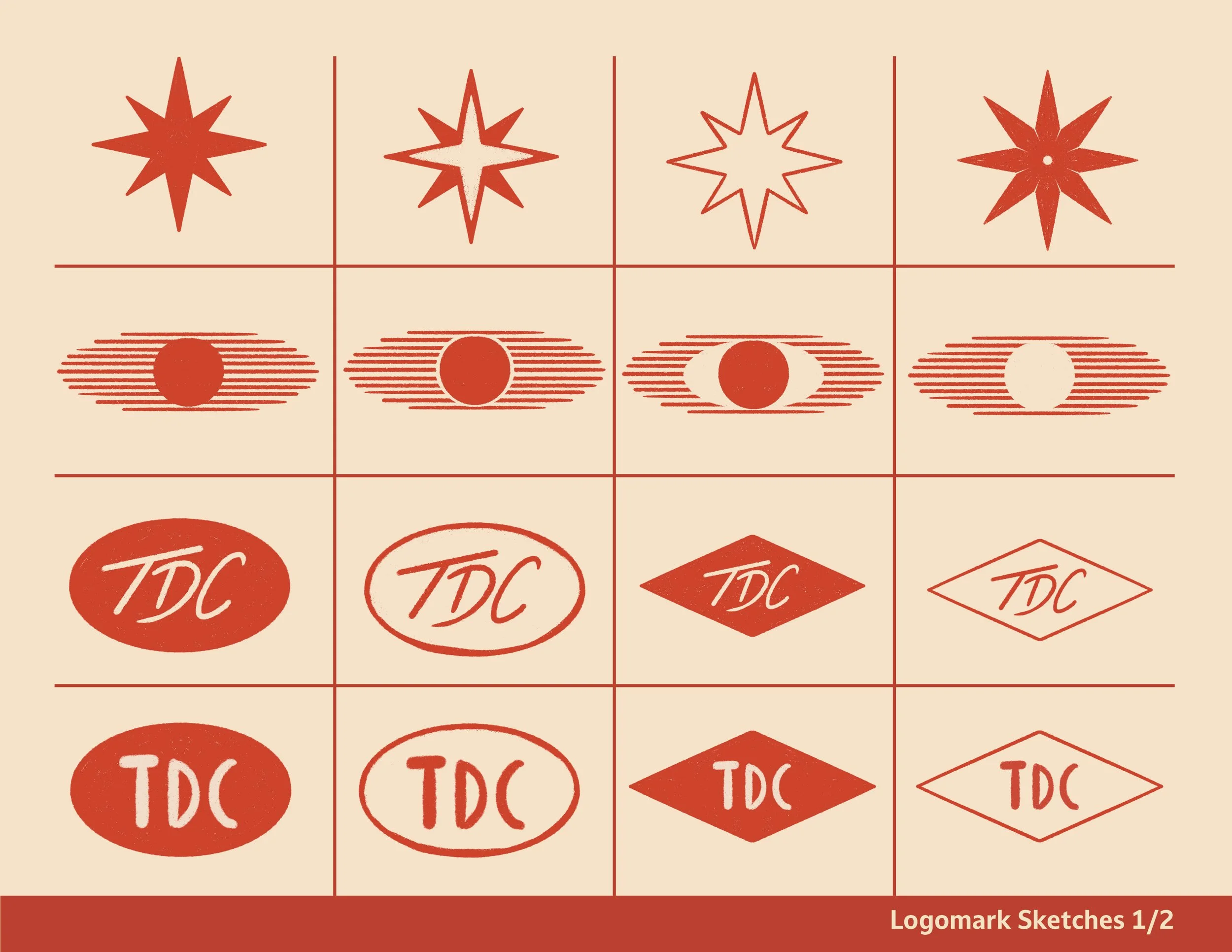
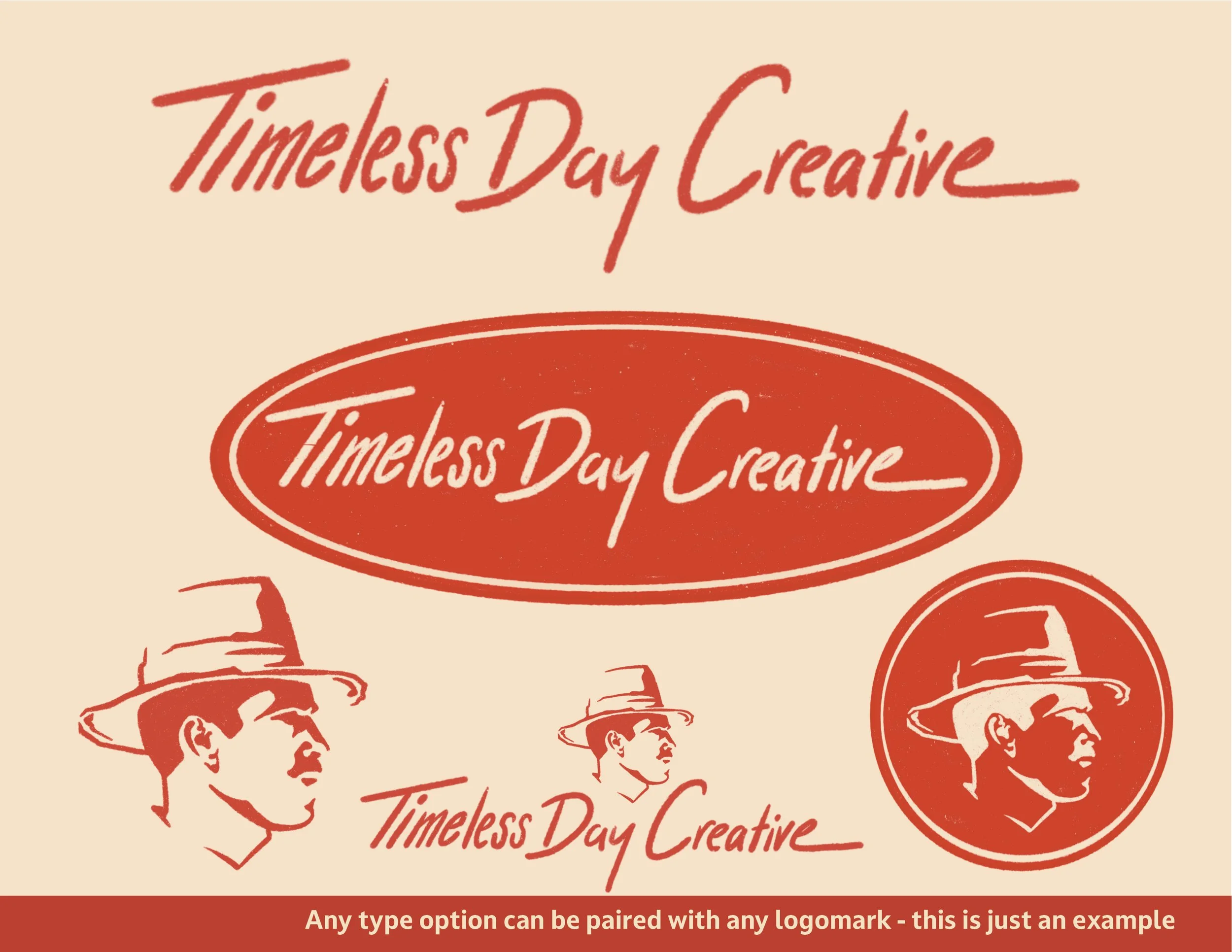
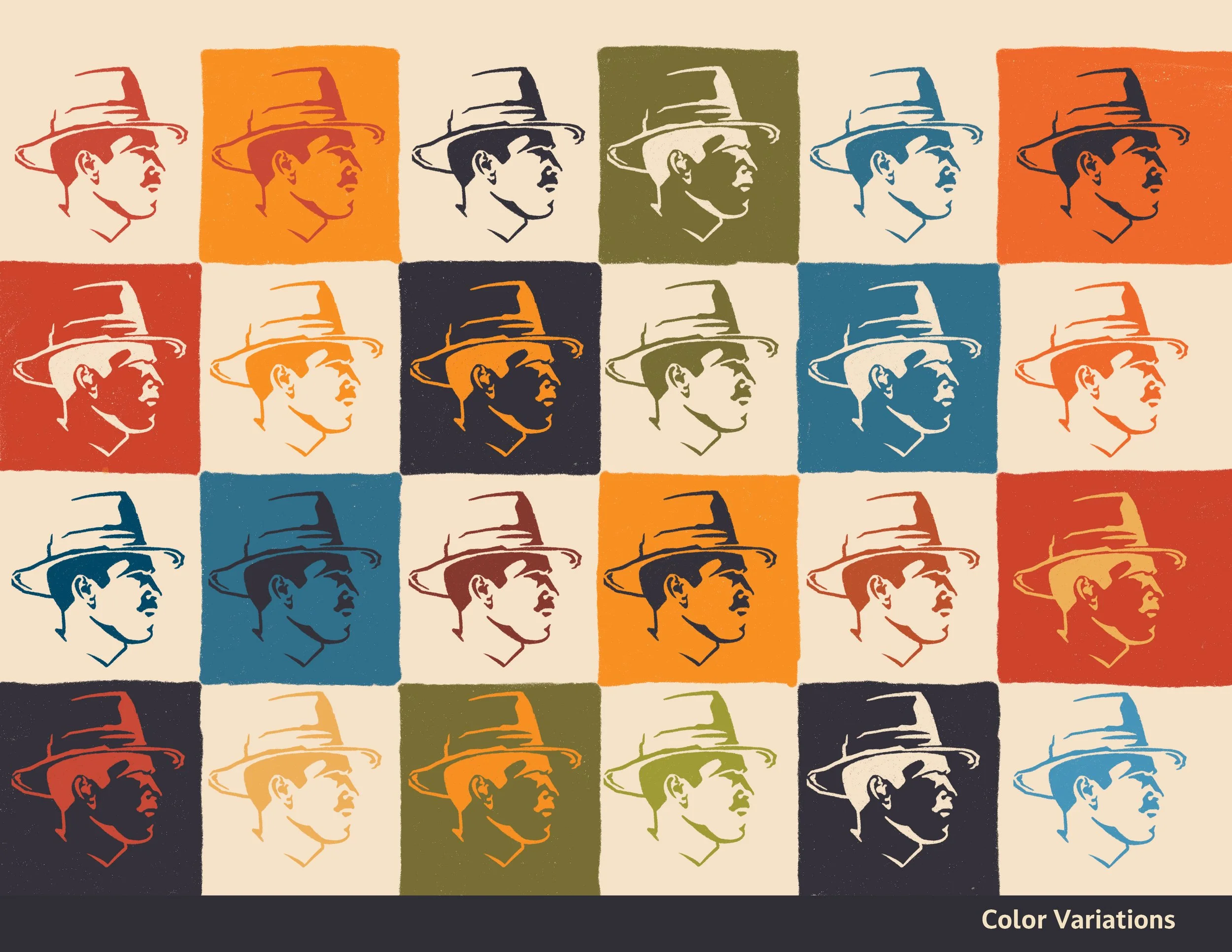
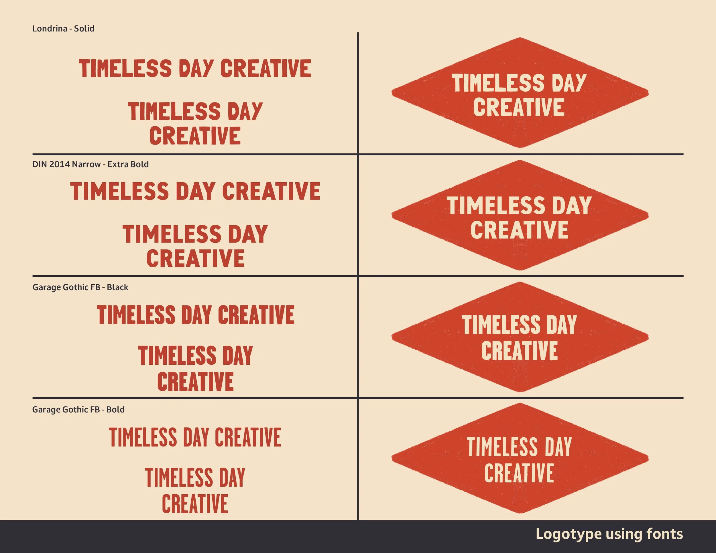
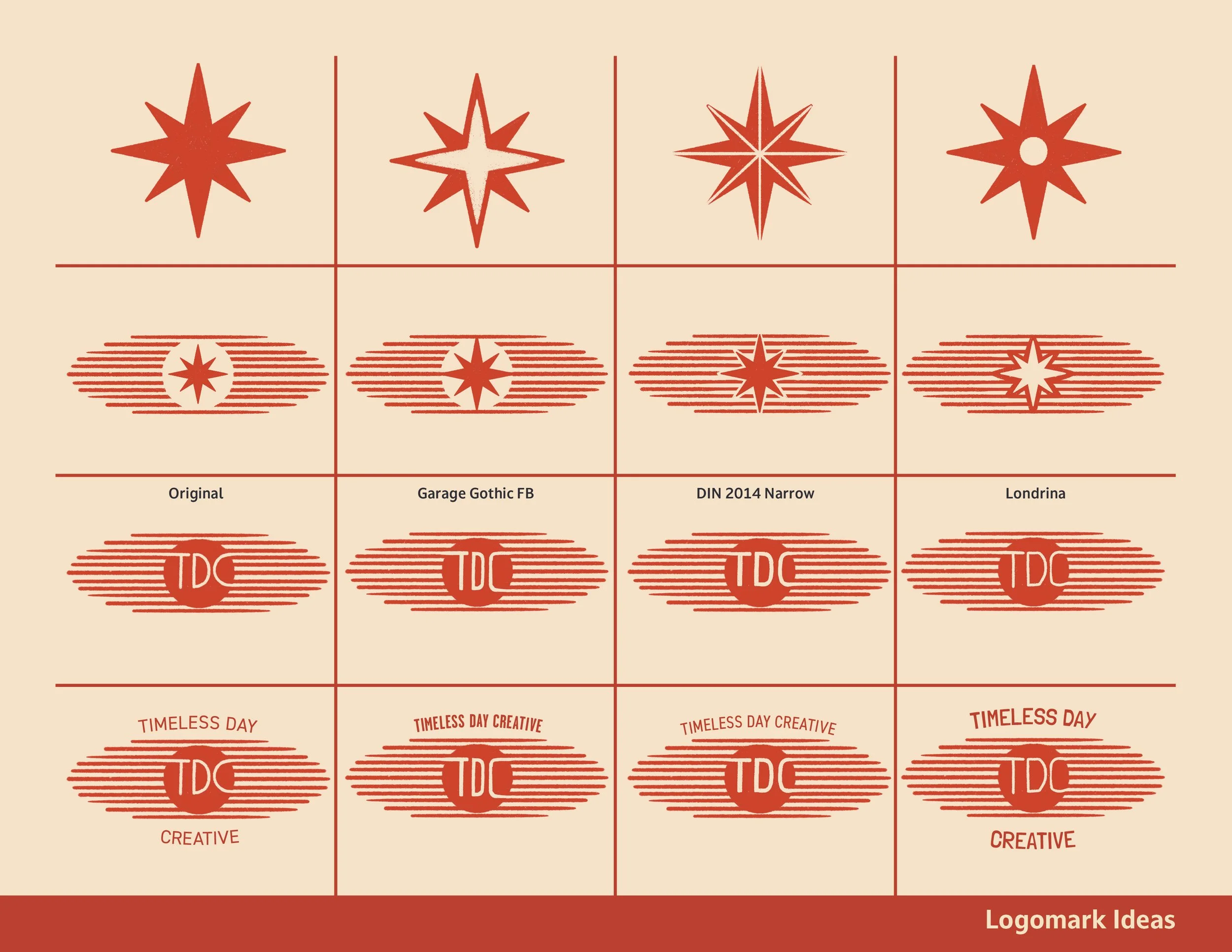
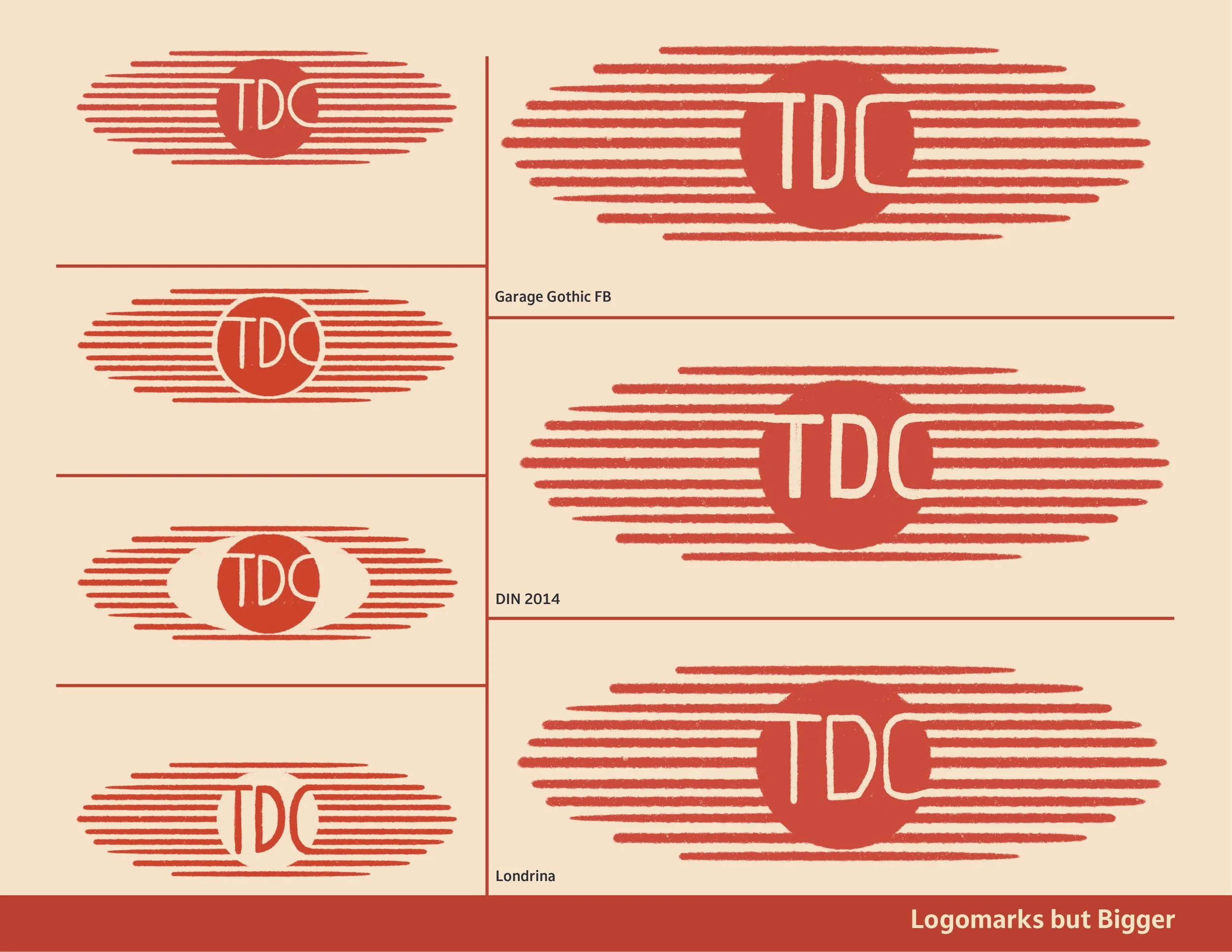
The logo and branding was meant to be clean and fairly minimal - modern yet classic to match the agency’s creative vibe. Each logo iteration was made so that it could serve as a stamp on any and all creative work the agency may be working on . The slightly rough edges and deliberately hand-drawn feel of the icons and typography were intentional to give a nod to the imperfect nature of timeless craftsmanship and artistry. The TDC logo mark in particular was created to emulate both the stylized image of a sunset and give a slight nod to the shape of a surfboard - a lifelong passion for many San Diego natives, including the guys who started the agency.
Process work
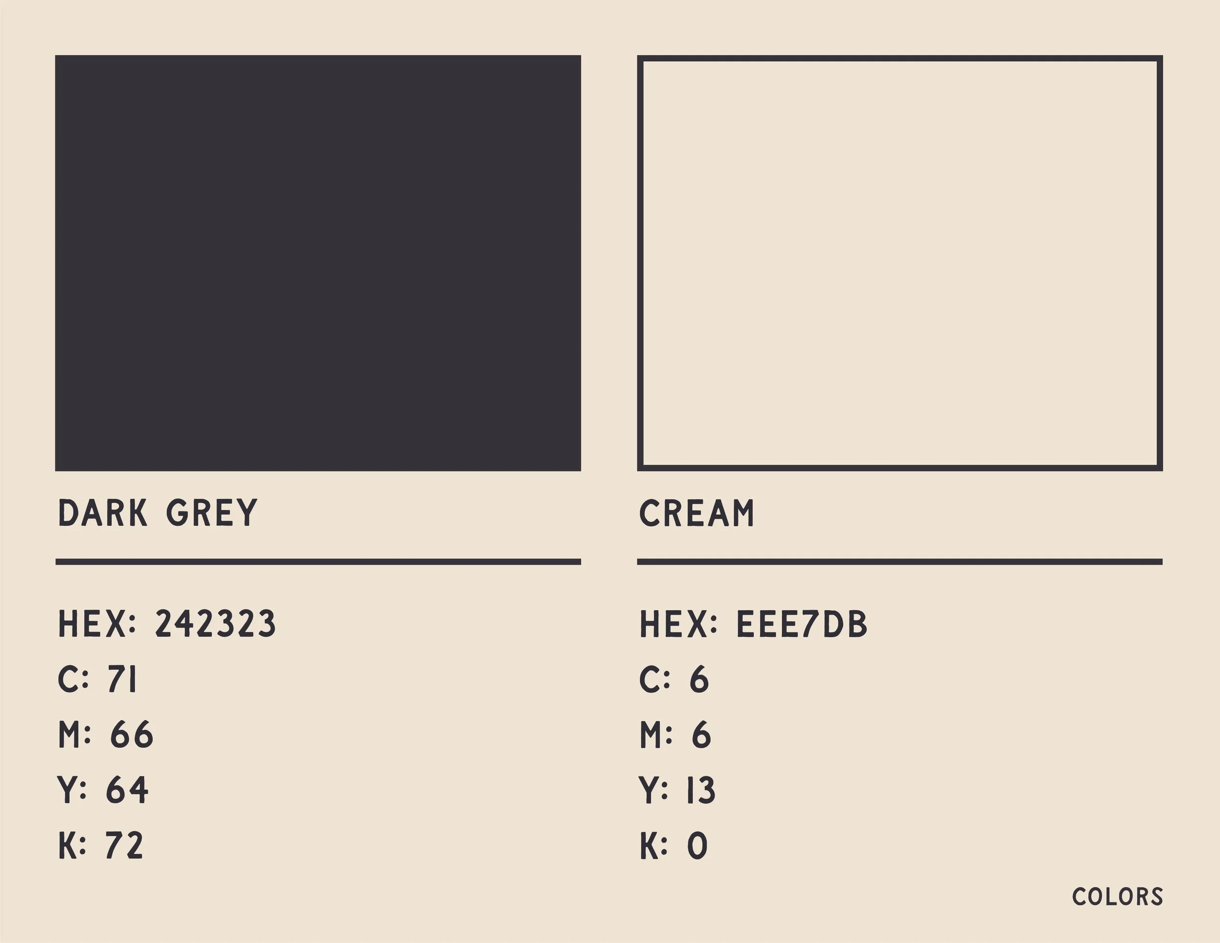
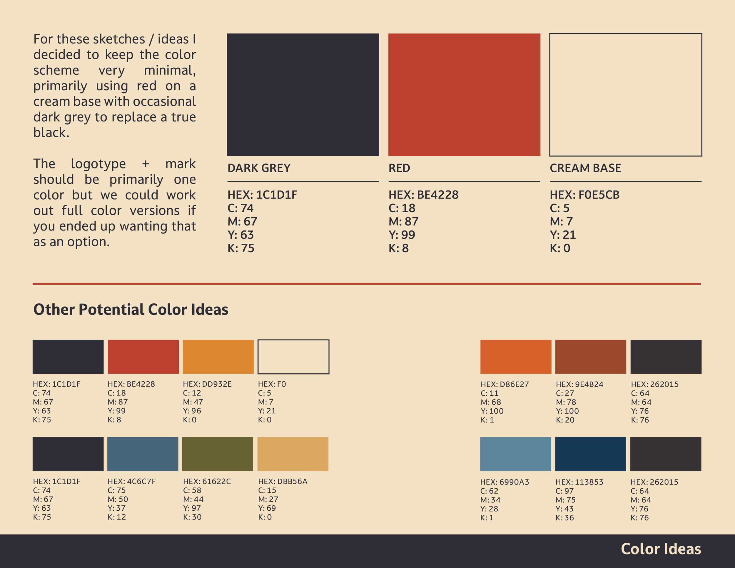
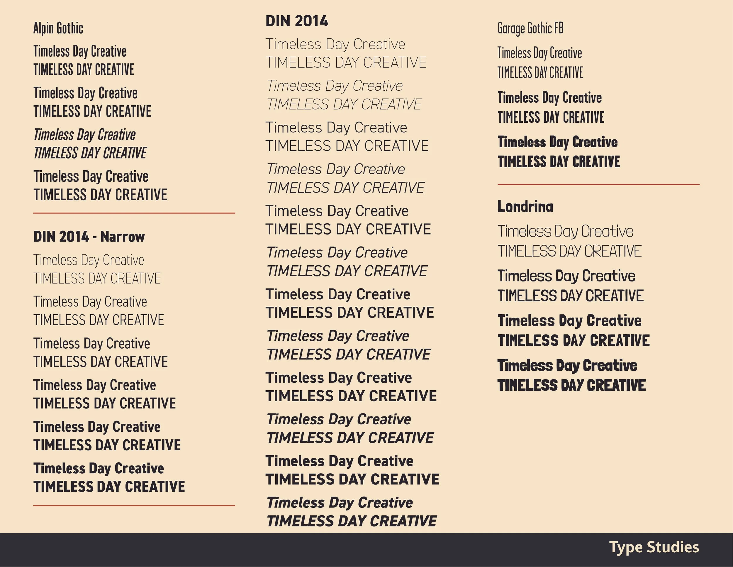
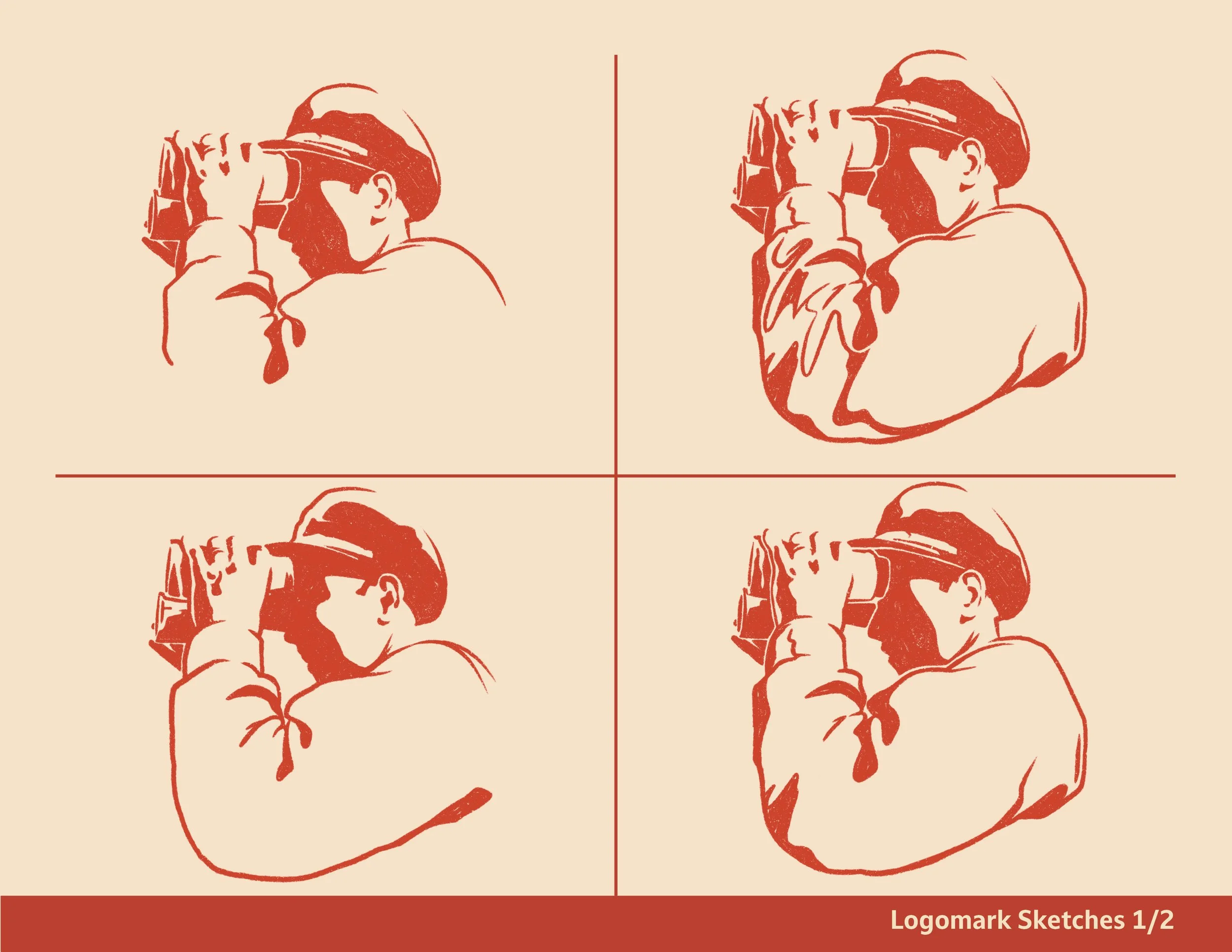
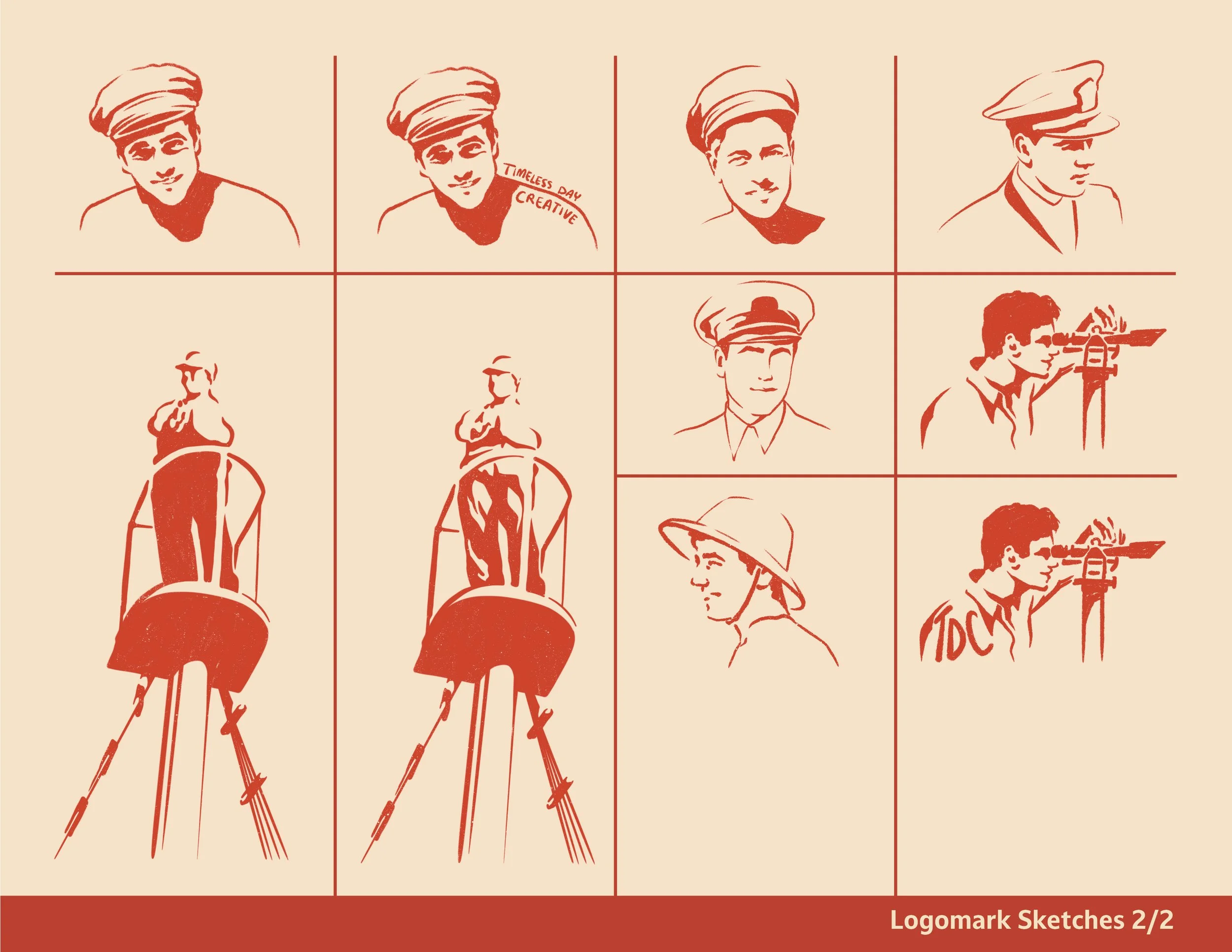
I worked very collaboratively with the team during the creation of this branding concept. As a creative agency, naturally they had a lot of great ideas that I was able to reference throughout my design process. Notably, they wanted something that felt like it could’ve been painted on the wall of a vintage car garage with an emphasis on simple colors, shapes, and natural line.
Sweet joy
Logo Design + Brand Creation for Cookie Business
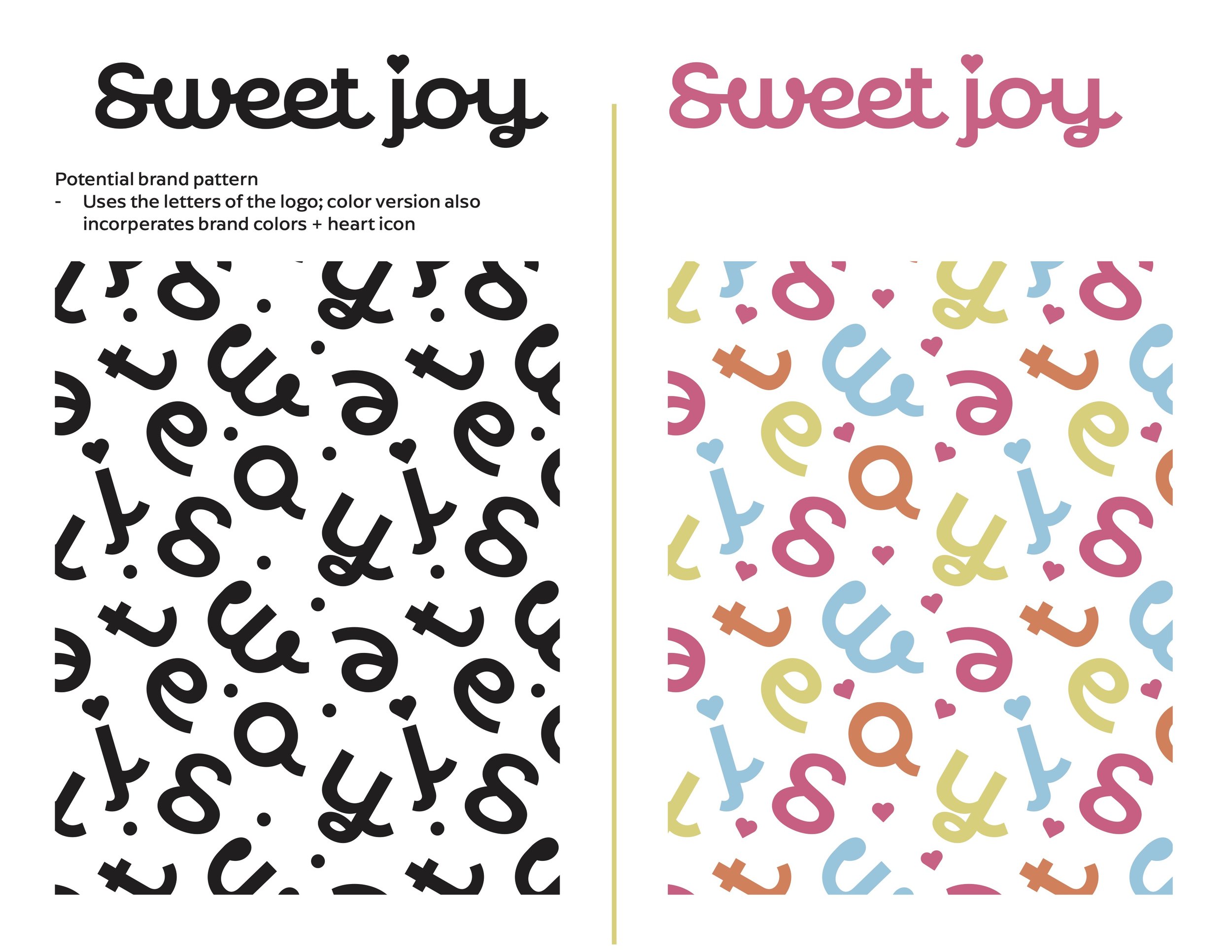
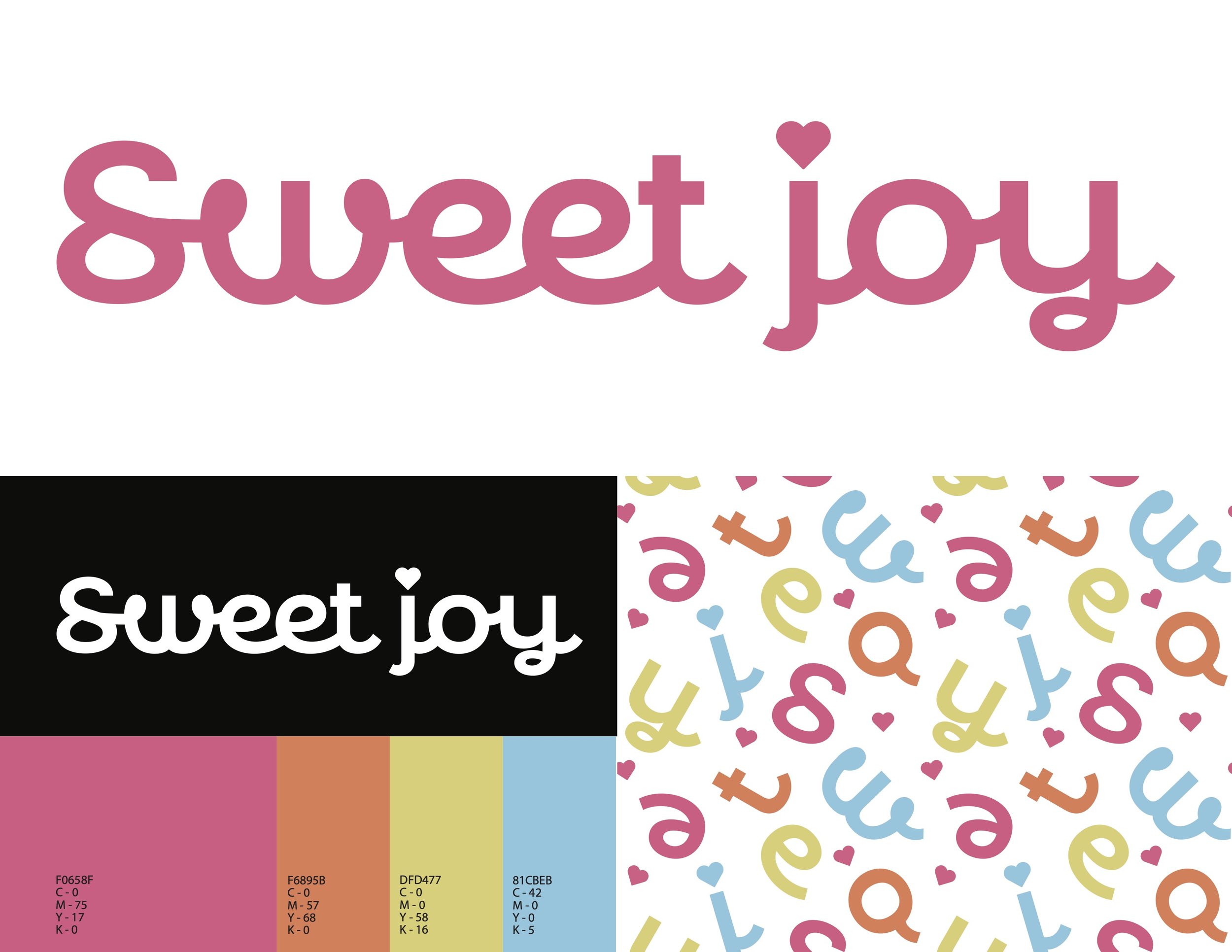
Sweet Joy is a burgeoning homemade cookie cookie company that was looking for a fun, playful, and modern brand identity to complement and enhance their sweet treats. I was the sole brand designer on this project and started it completely from scratch with no previous company logo or branding to reference.
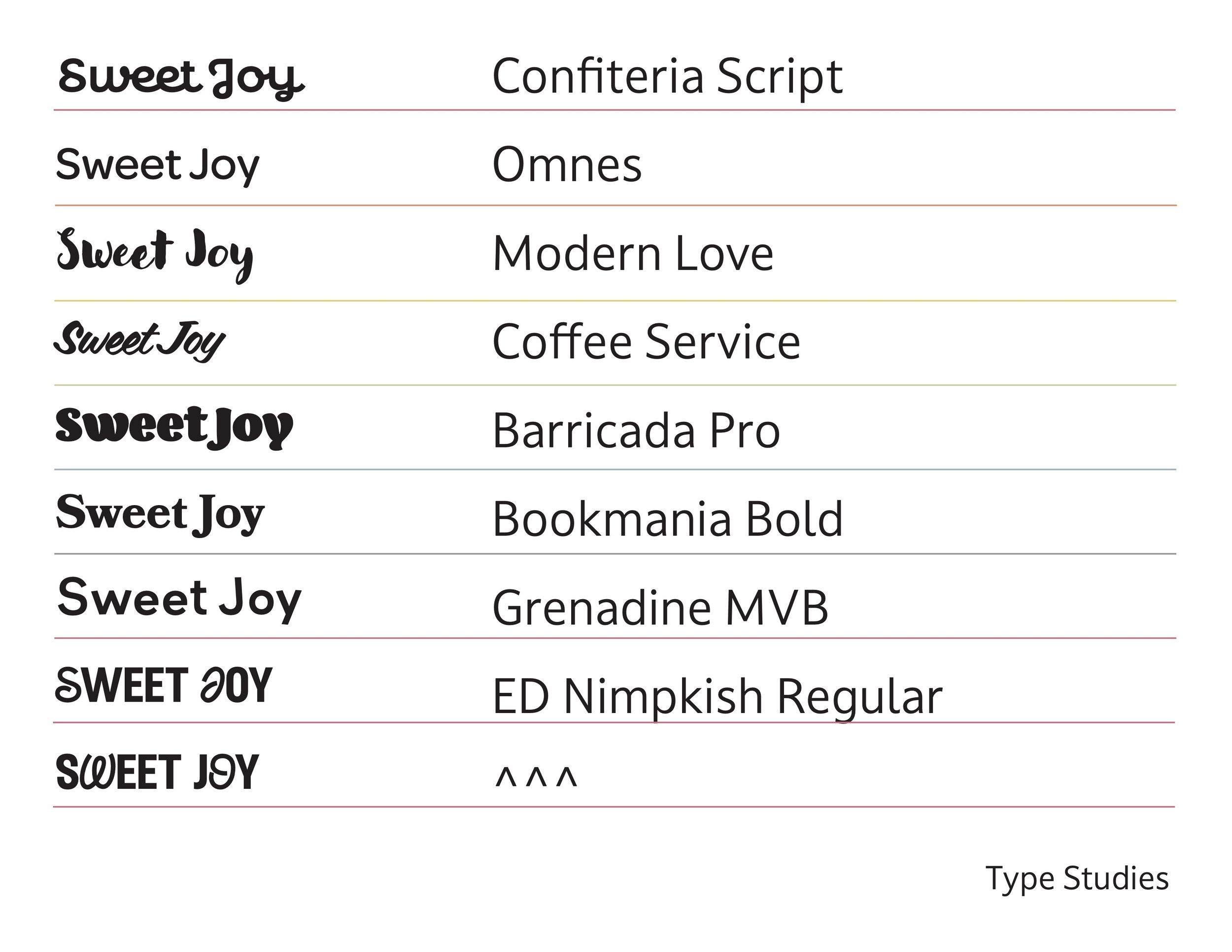
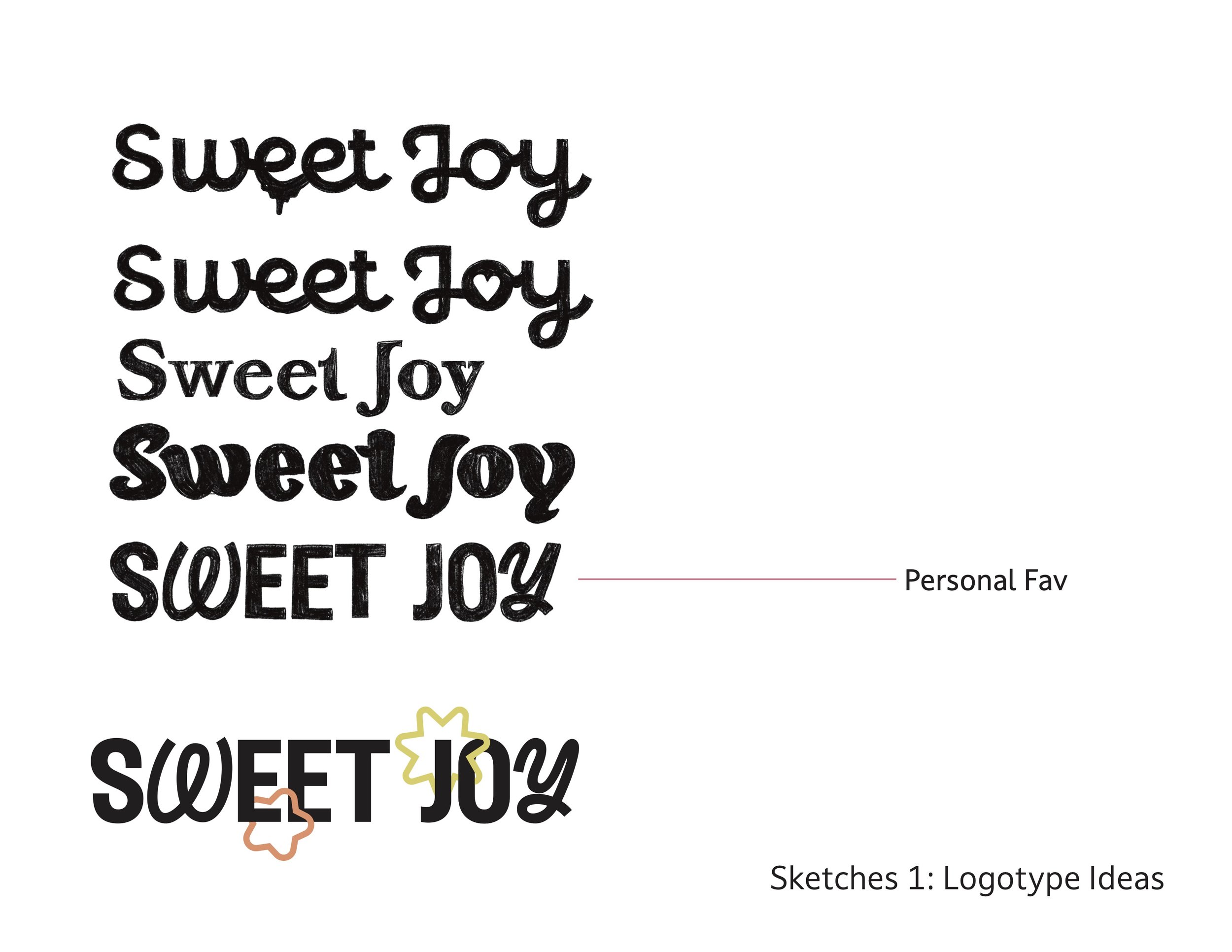
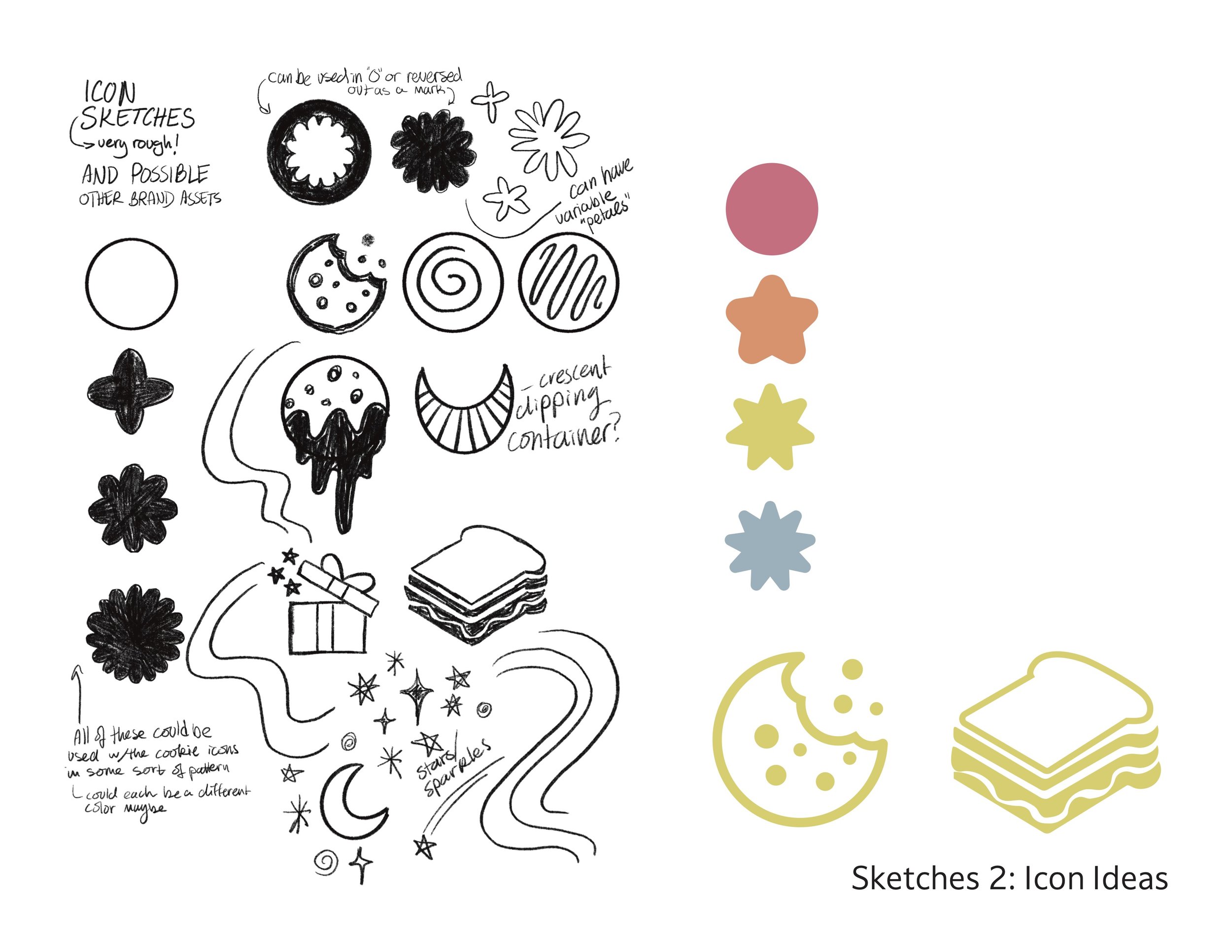
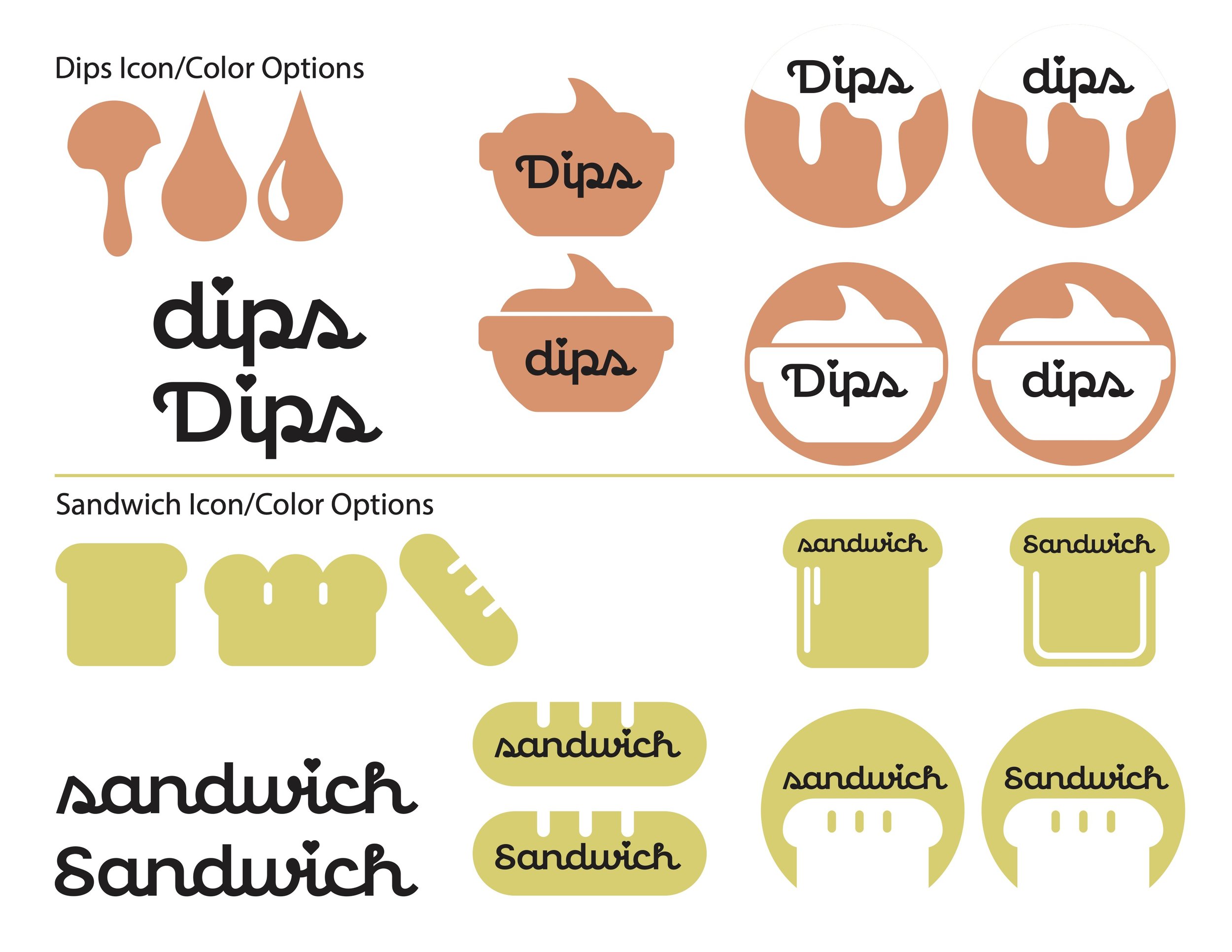
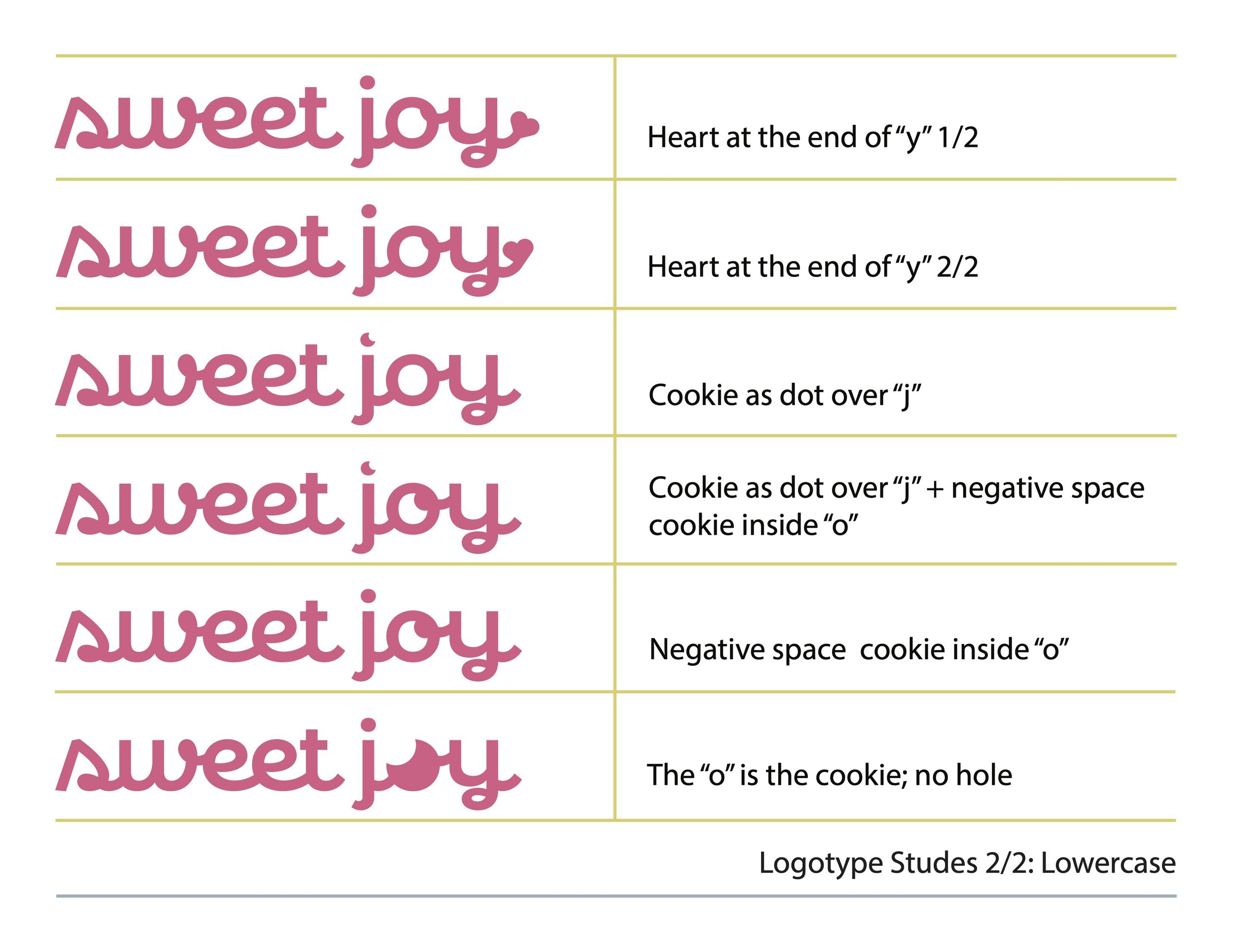
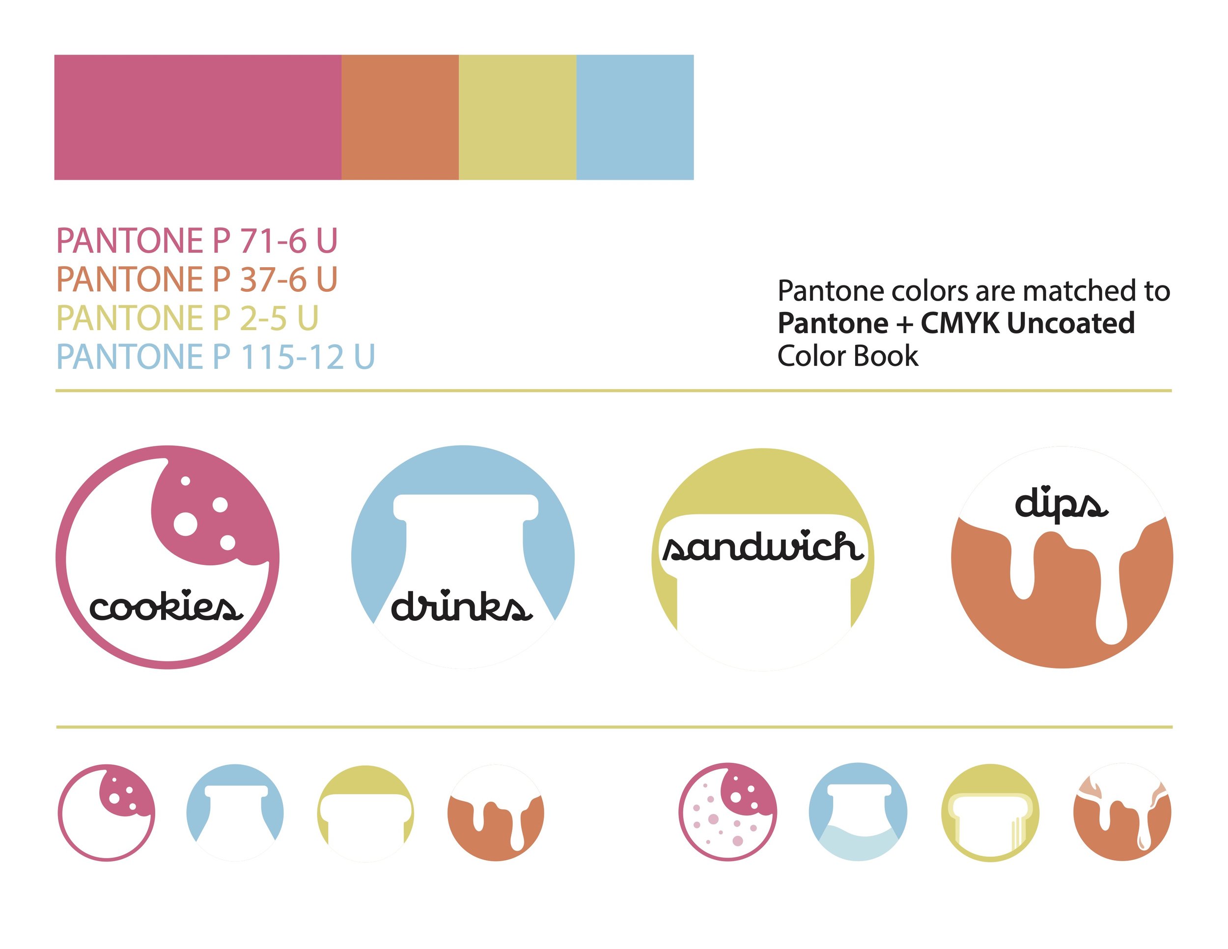
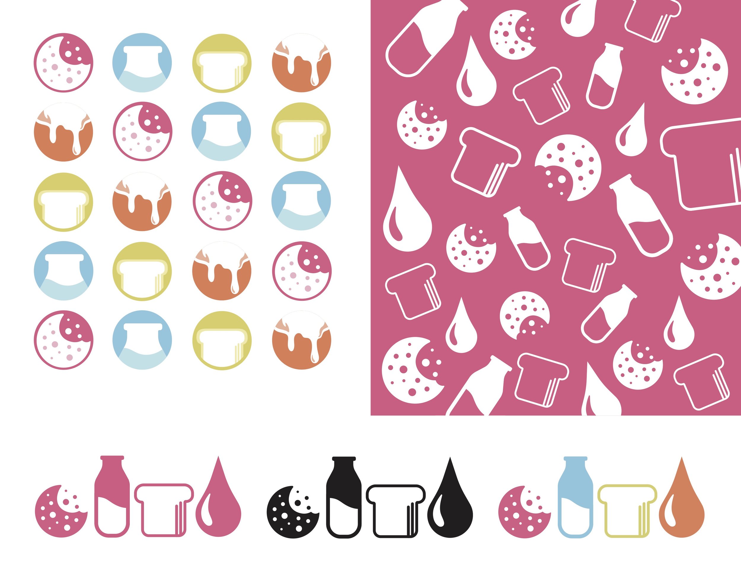
We ended up settling on a bold and modern script to form the basis of the logotype and developed a series of icons to represent different treats that would be sold at the eventual shop. The package design is still in process as the business has yet to fully take off in full, but the brand identity has been completed after lots of collaboration and cookies.

Process work
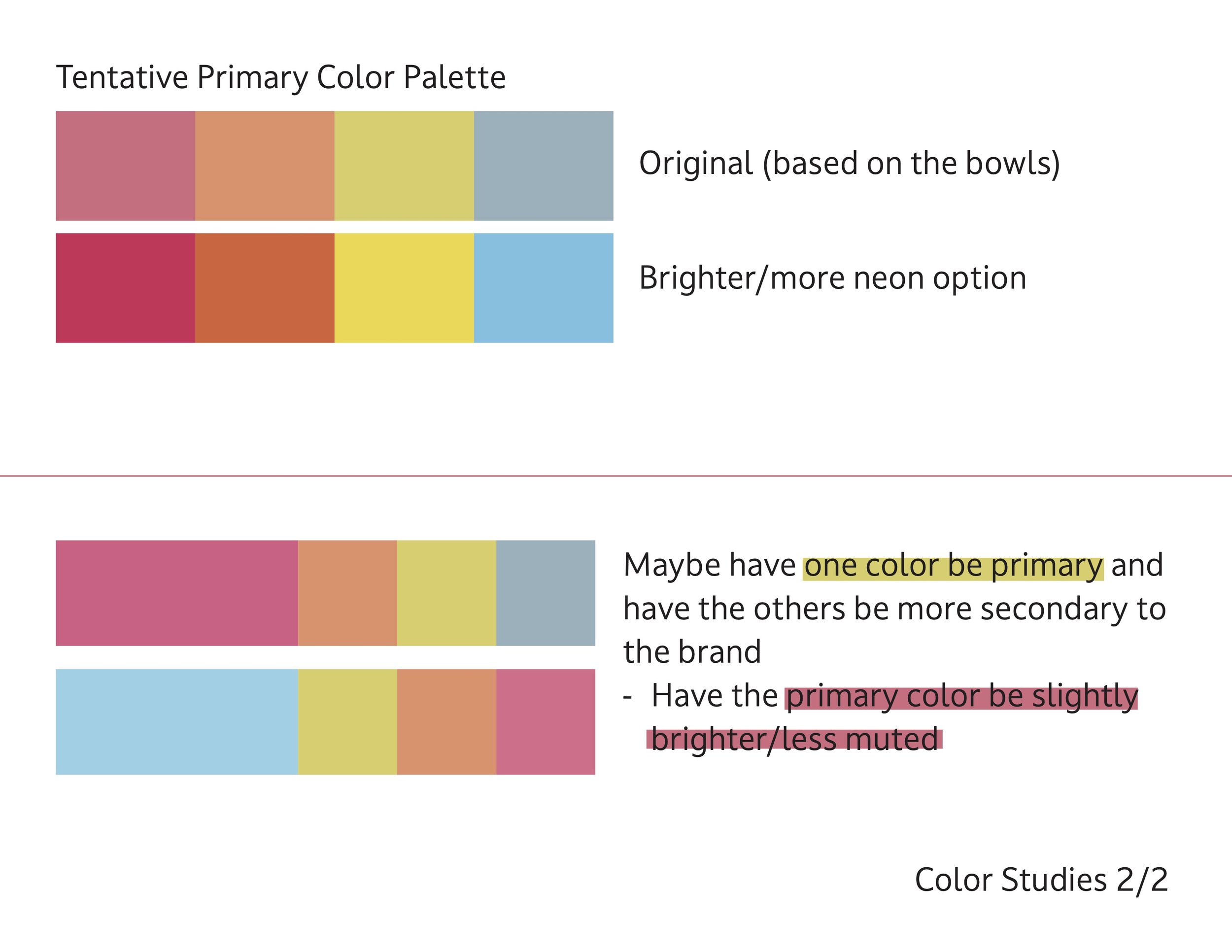
Although I was the only designer working on this project, I worked closely with the owner of the business and we went back and forth many times over a number of months to try and hone in on creating exactly what she was looking for. The colors were based on a set of bowls she uses to make the cookies - basically everything else was developed over time.



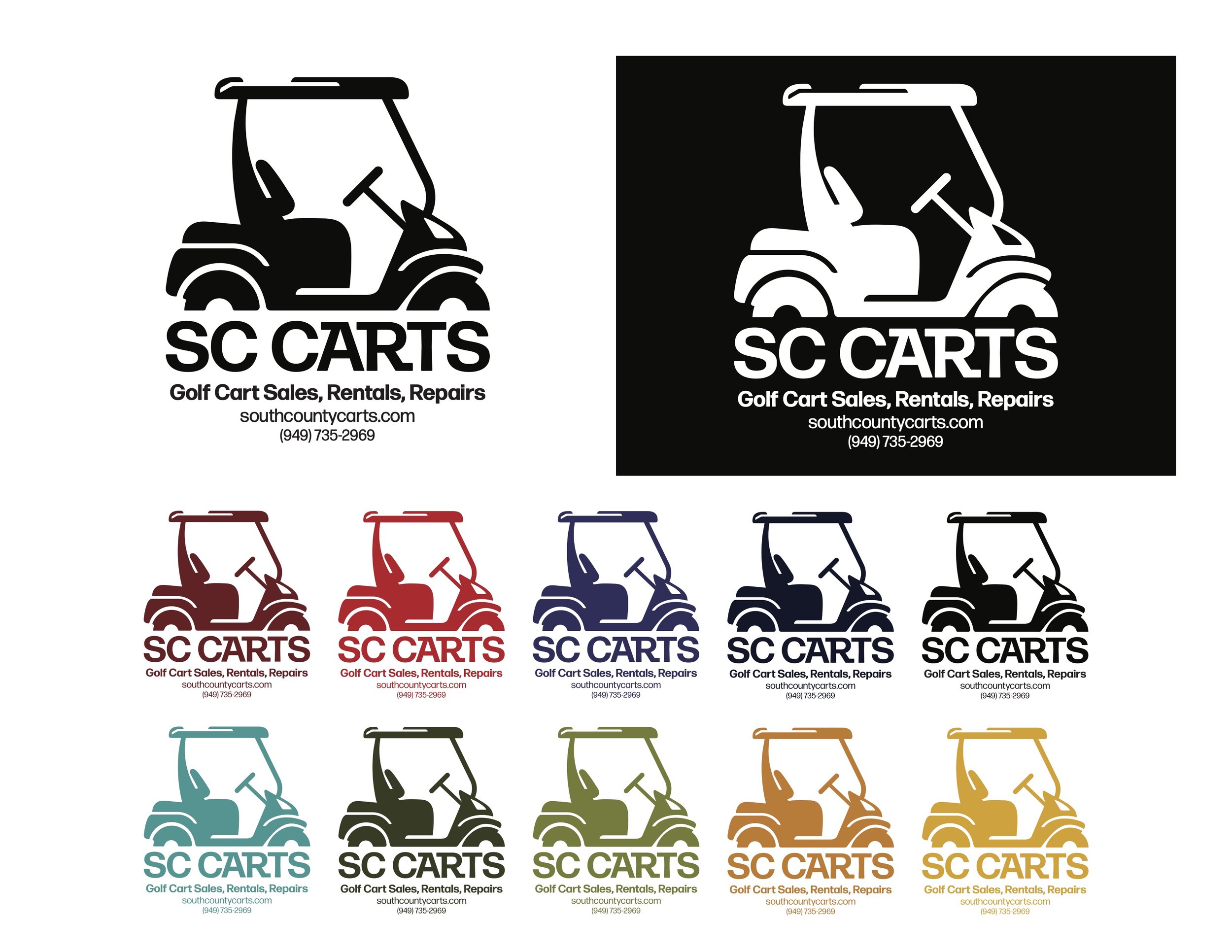
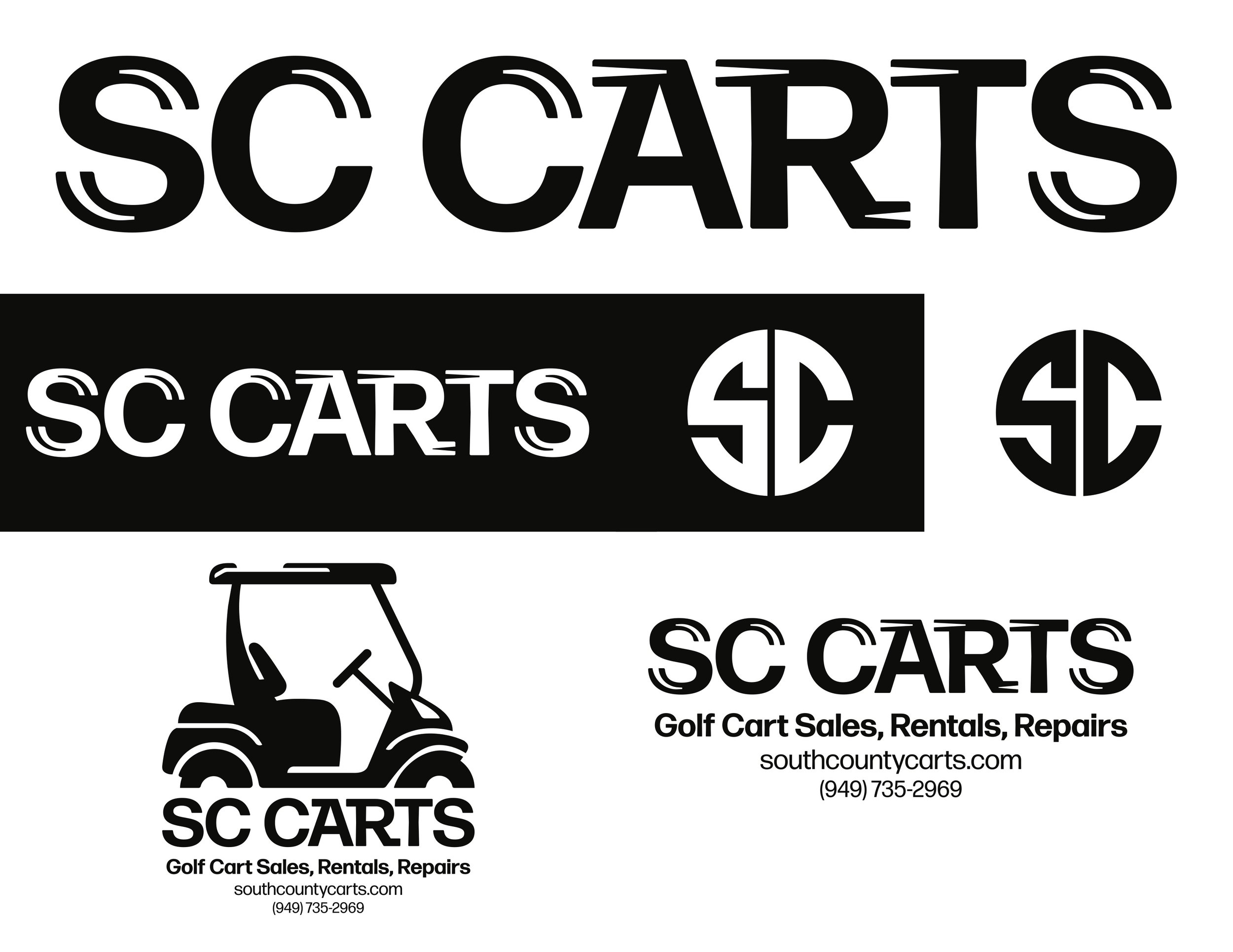
SC CARTS
Logo and Brand Re-Design for Custom Golf Cart Business
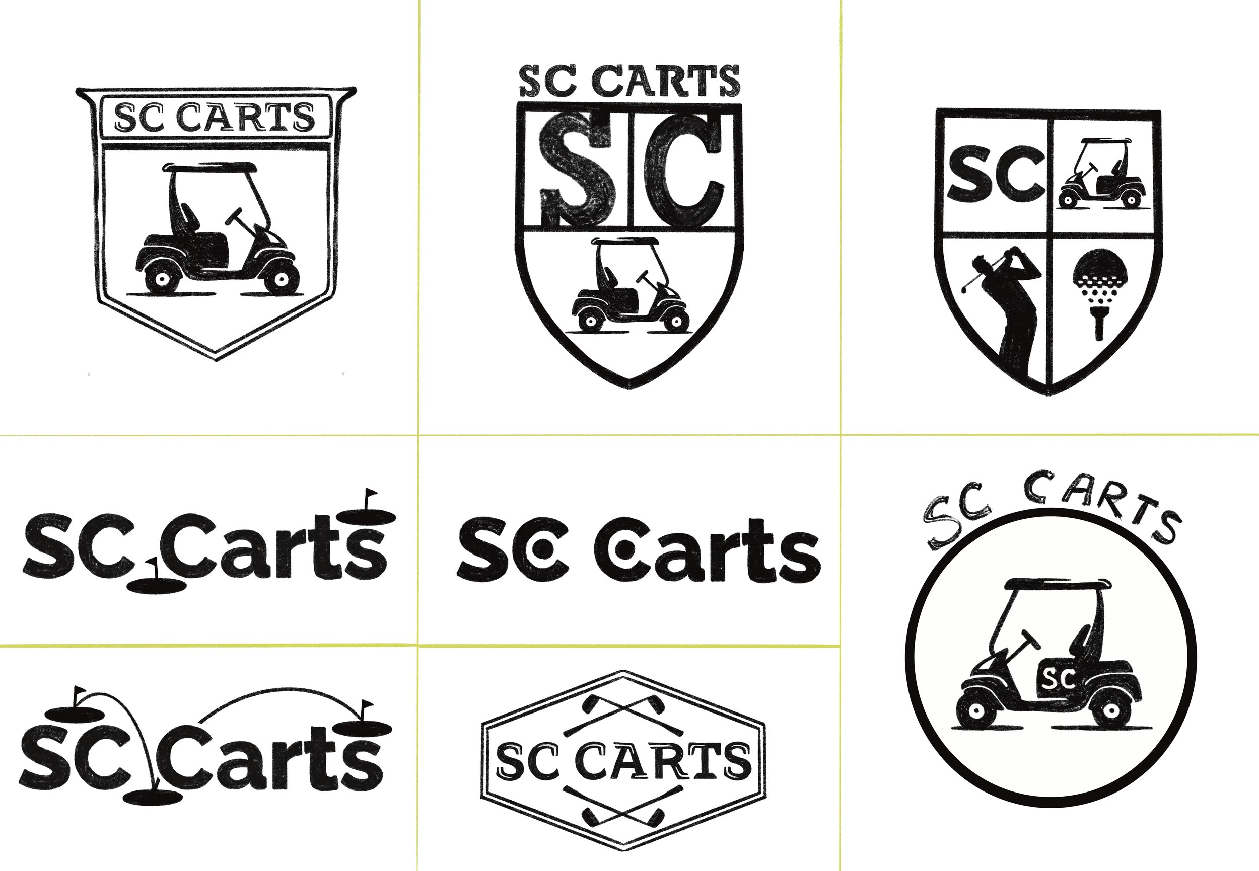
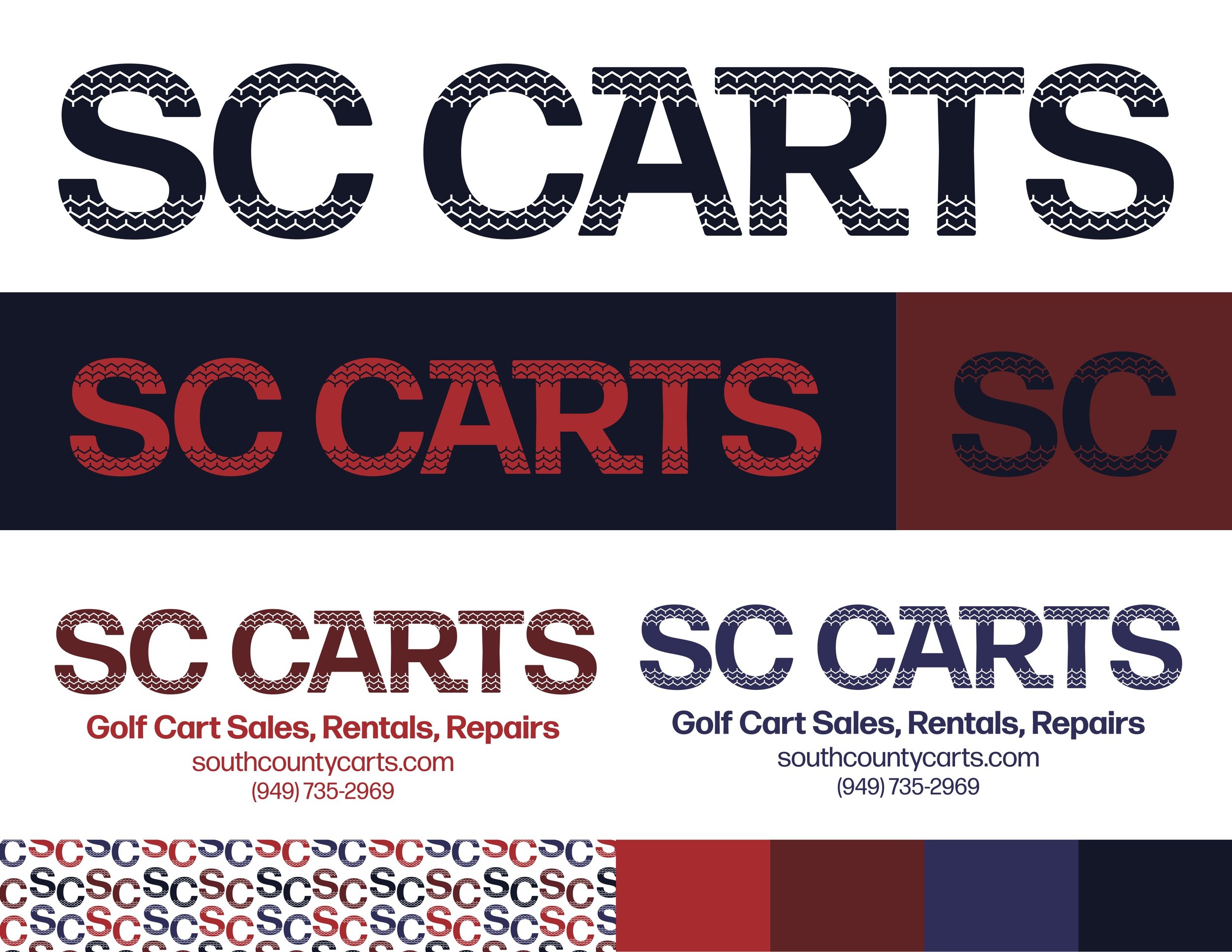
Before I was brought on board to re-brand SC Carts, their visual brand was basically nonexistent - their logo was golf cart clipart and their logotype was a slab serif that would have been better suited to an amateur sports team. In a way this meant I was working from nothing, creating the brand’s look and feel from the ground up.
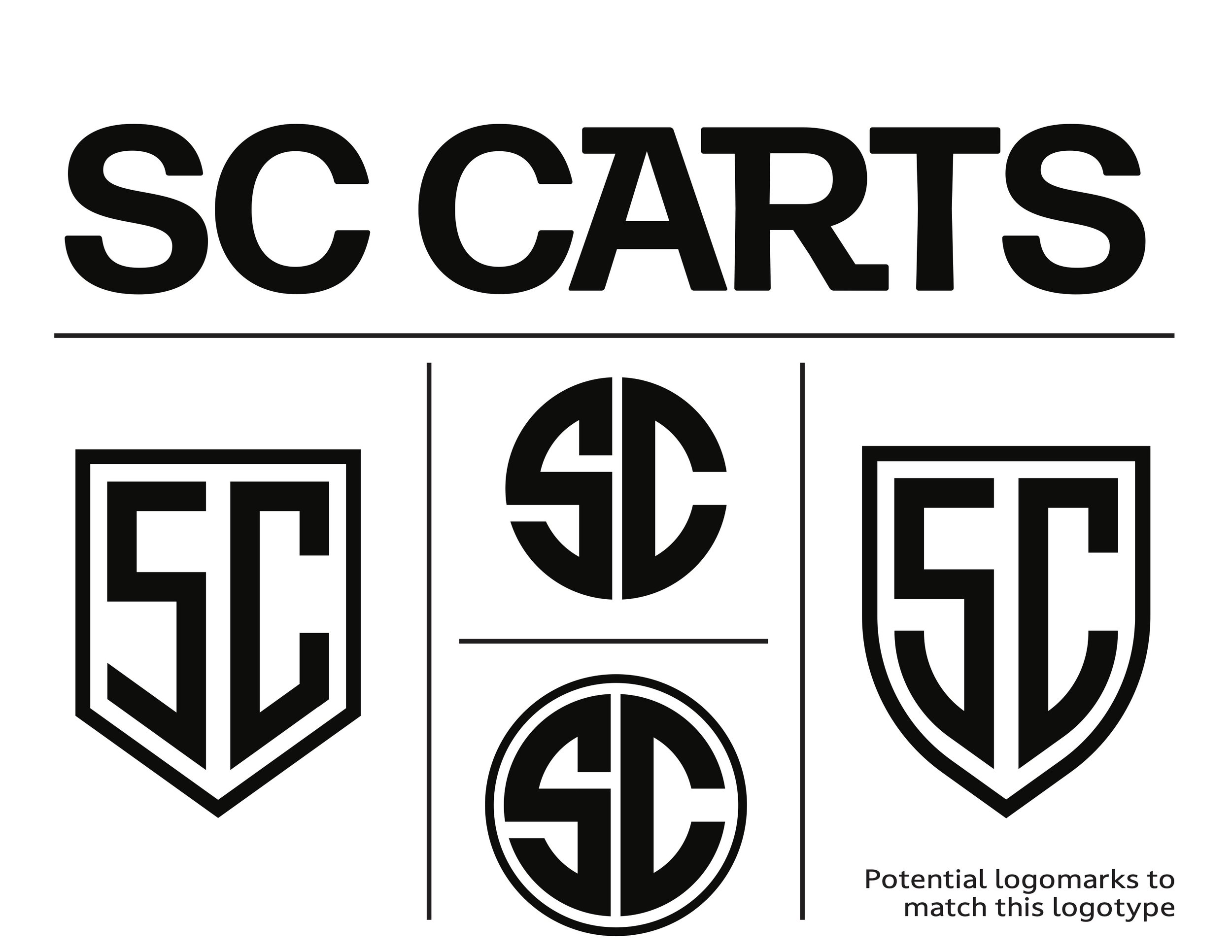
I wanted to create a visual identity that would look sporty without being overtly so, reference classic golf heritage, and give the brand a clean and modern identity to move forward with.

Process work
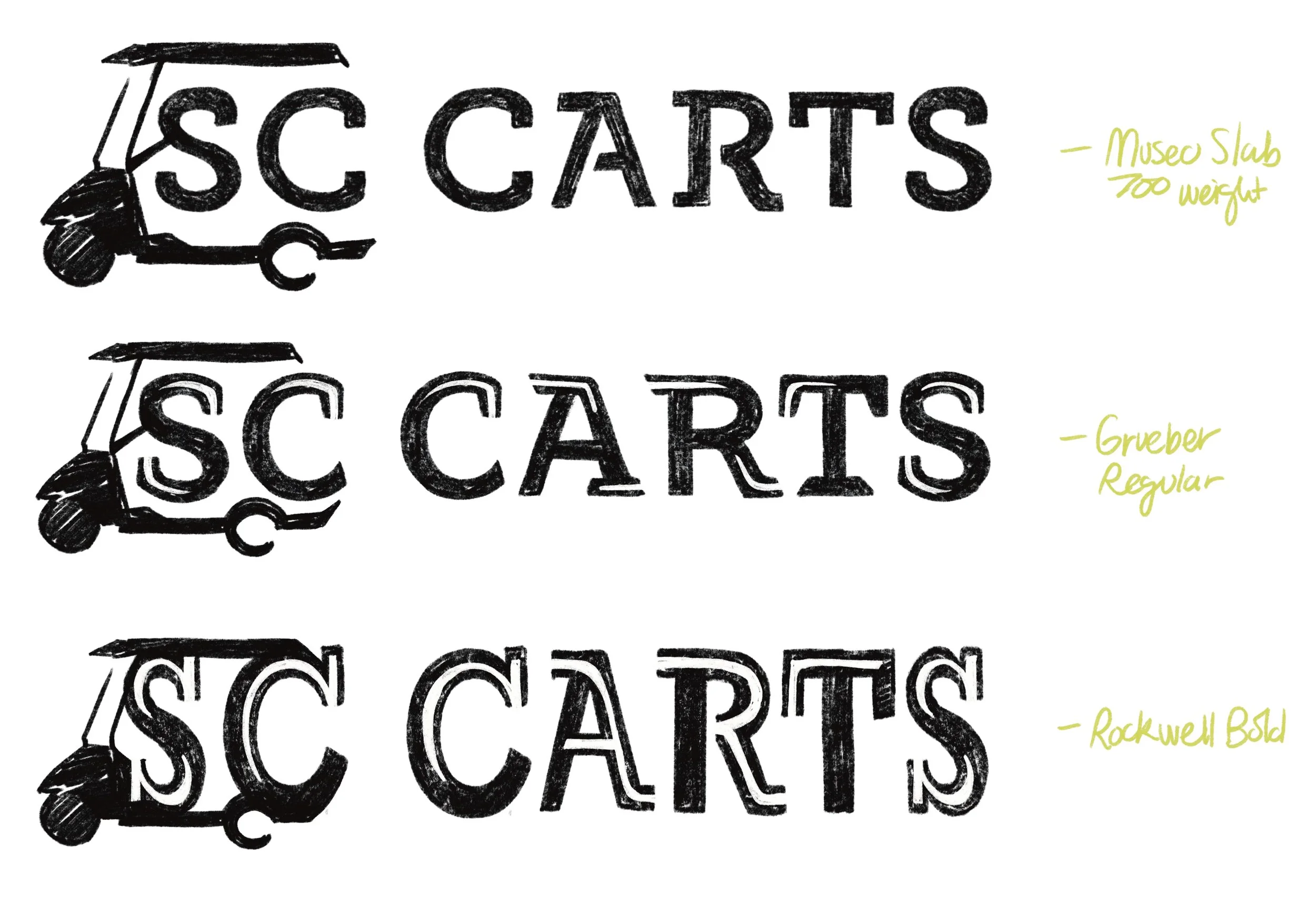
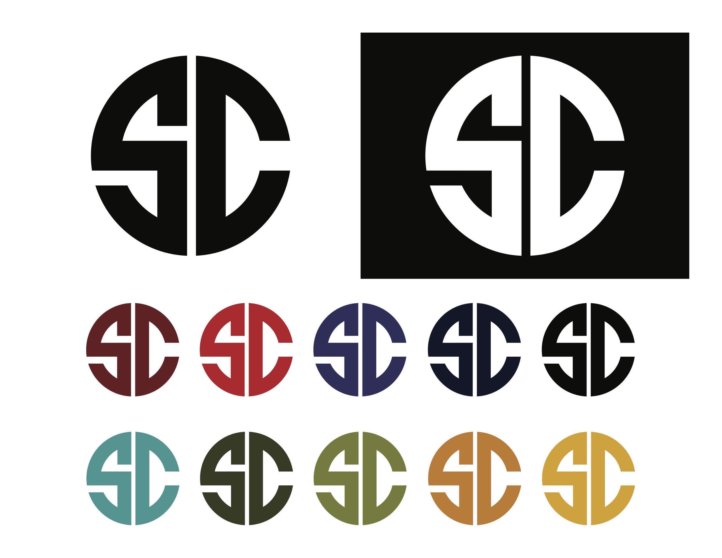
During a period of a couple of months, I conceptualized and created this brand identity while staying in constant communication with the brand’s owner to make sure we were always on the same page about the visual direction I was going in.
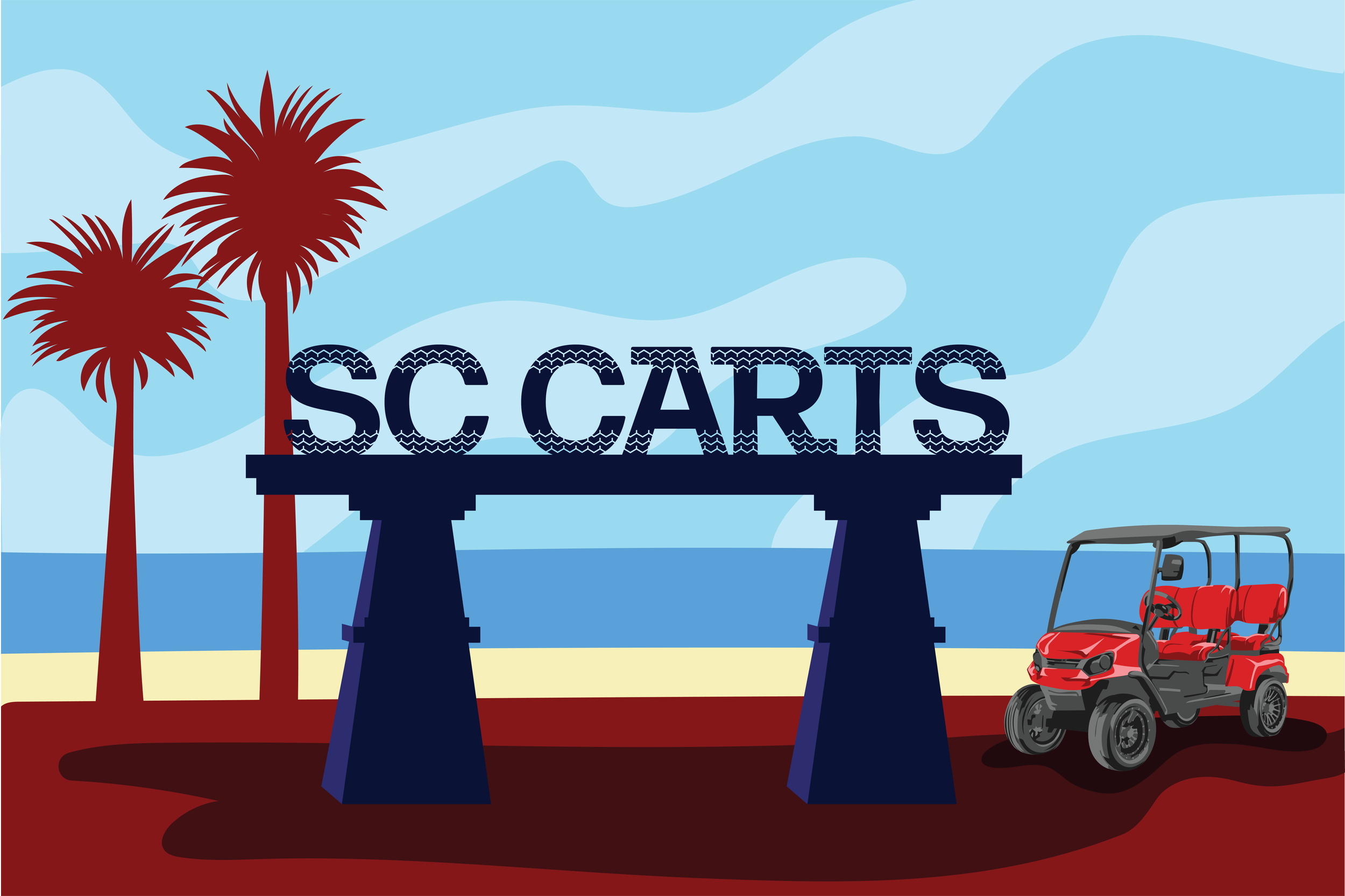
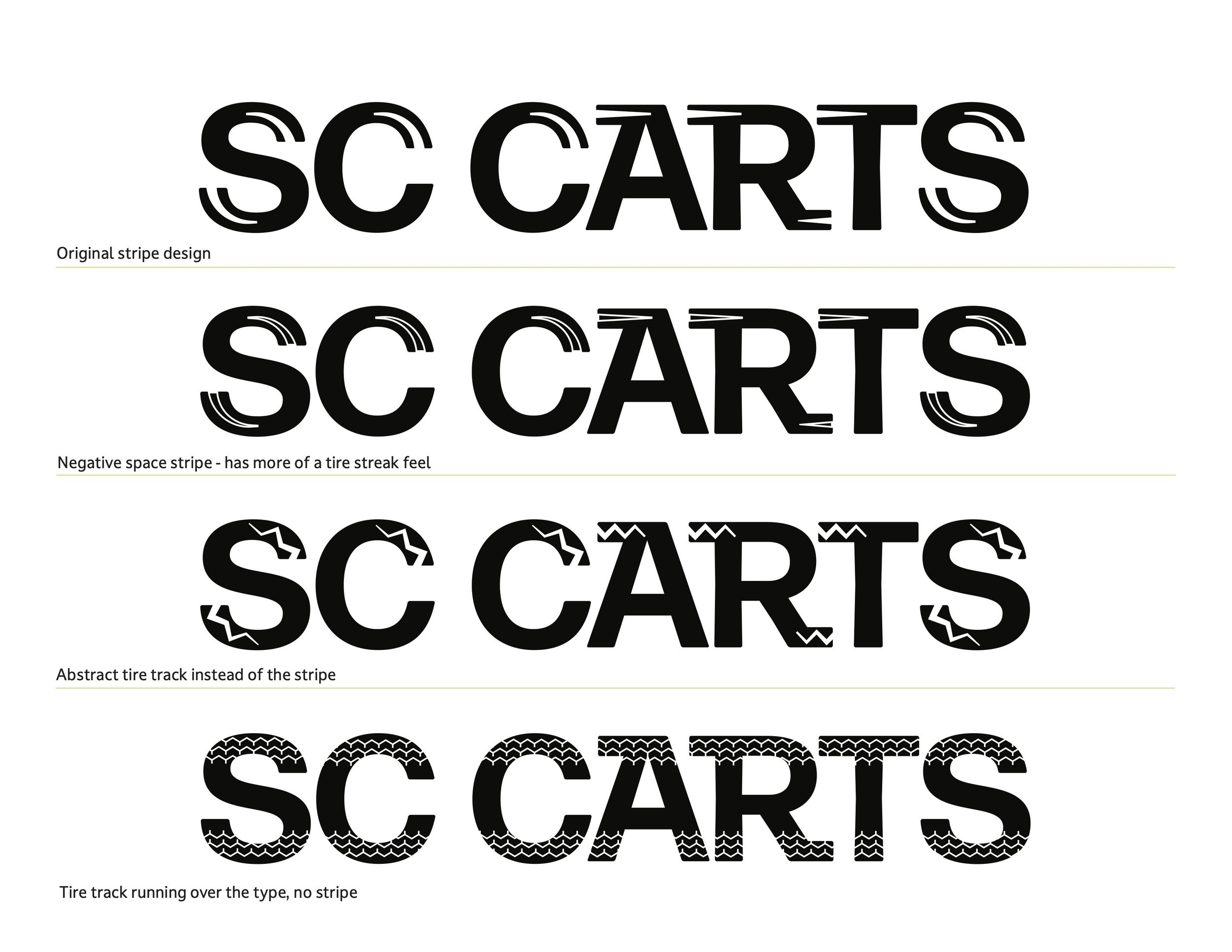
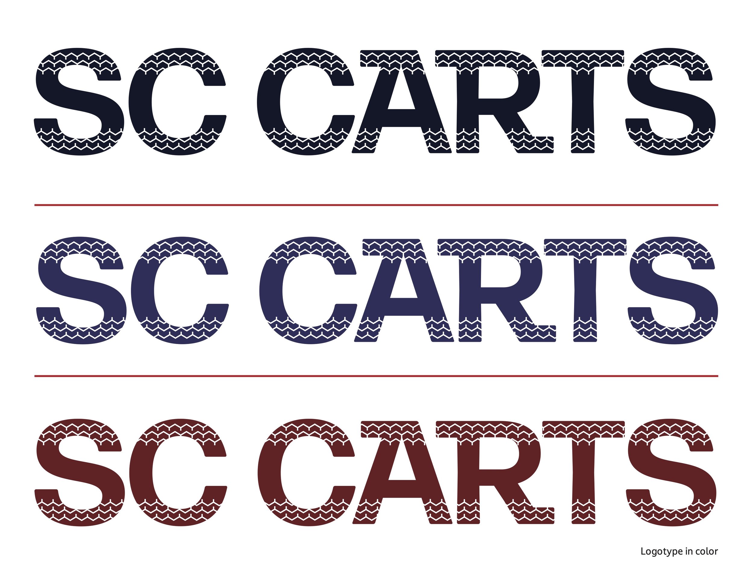
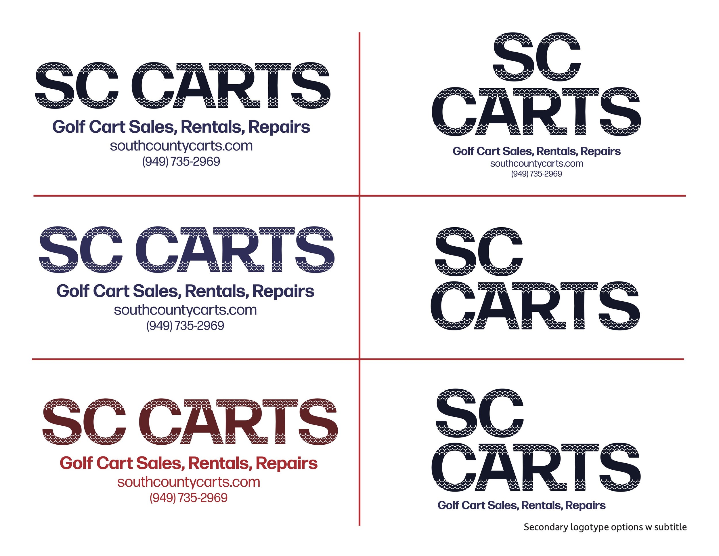
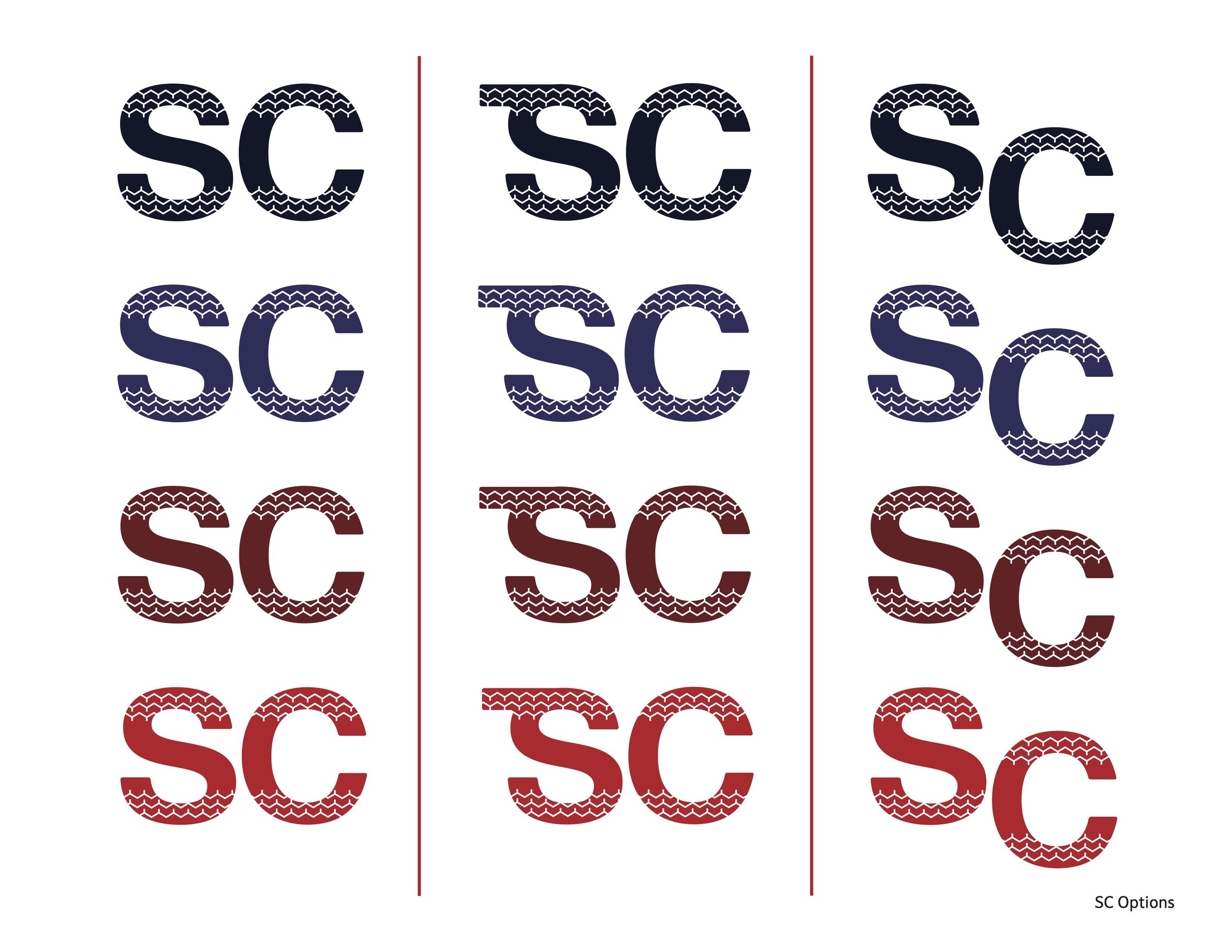
He ended up really wanting a “tire track” incorporated into the logotype (an idea which threw me for a loop initially) but I ran with it and re-worked my logotype and mark ideas to align more clearly with this new direction.


SIGN PROCESS + DESIGN
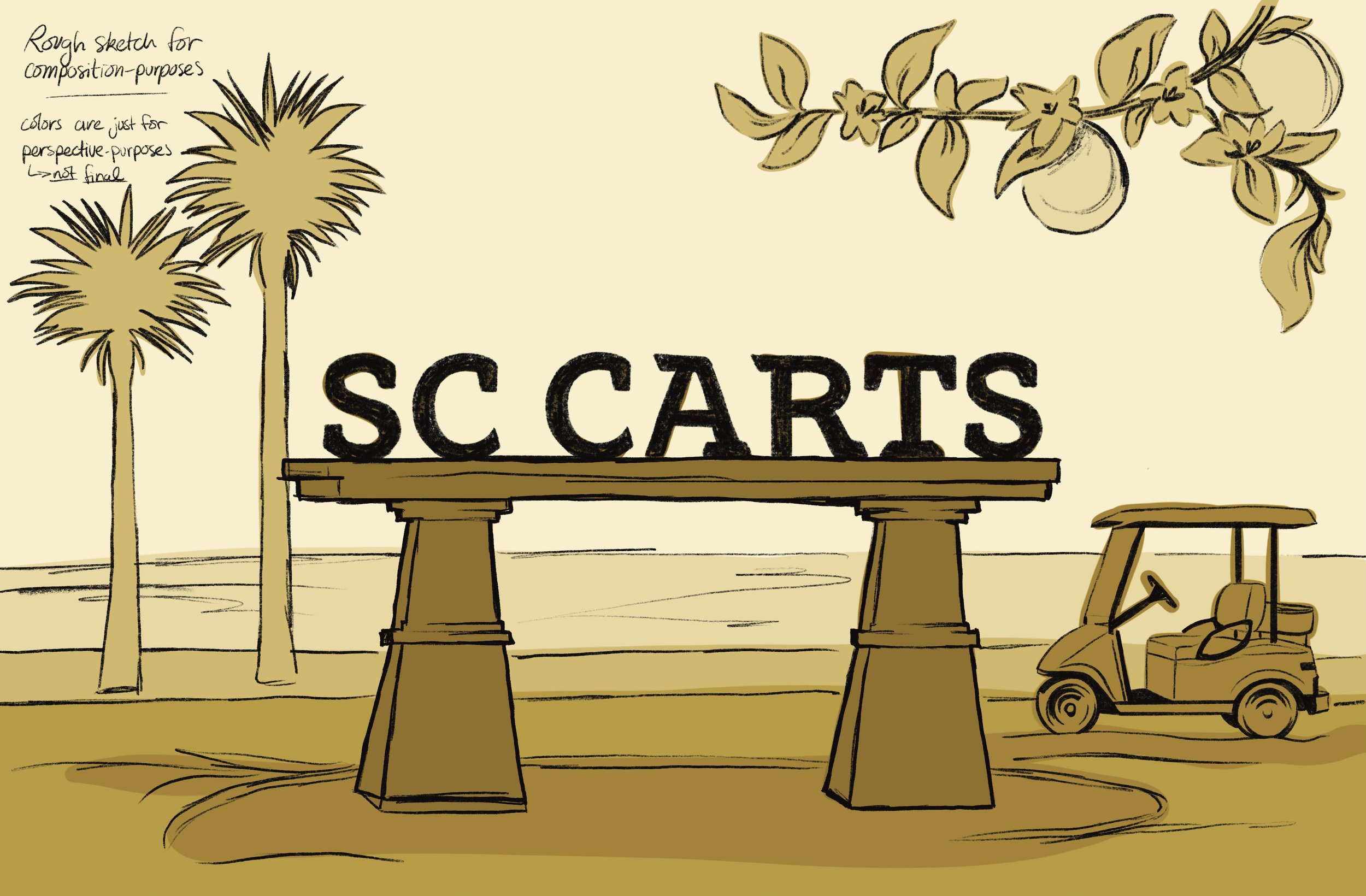
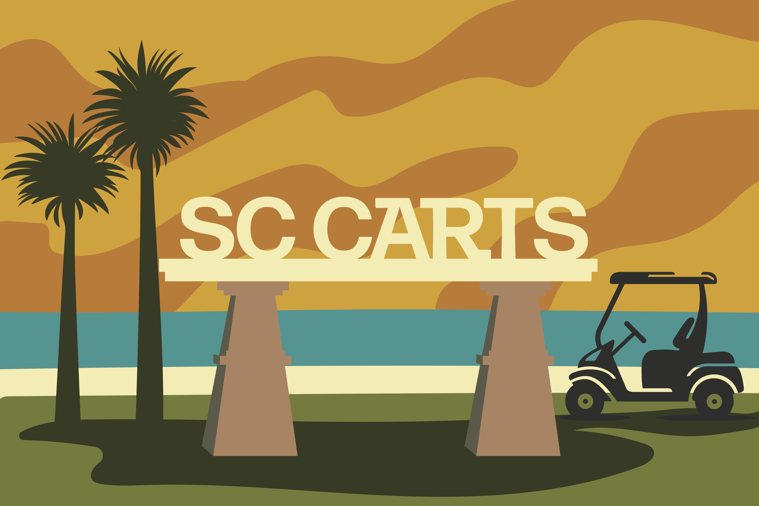
The owner also requested an illustrated design that could be used as a large-scale sign on the side of their building. He wanted the design to reference the iconic Orange County sign off the 5 Freeway so I decided to use that image as a base and work from there.